As we move further into a post-Flash(1) web there’s a lot of excitement and hype about HTML5 and CSS3. These new technologies combined with the power of JavaScript frameworks like jQuery offer the potential to create much more dynamic, animated, interactive user experiences on the web.
Many tools are now being developed to make the creation of these experiences much easier (Edge, Sencha, Hype, MotionComposer, Animatable(2) etc). However, there’s a potential danger lurking under the surface with these apps and the many demos and samples showing off these new shiny features: Machine Generated Code.
Made in the image of Flash
Any serious web developer would not consider the HTML code rendered by tools like Apple’s iWeb to be clean or optimal but rather to be bloated and messy. With the rise of ‘HTML5’ and the previously mentioned apps it seems that some normally standards-aware developers are being swept along with the buzz, happy that you can now do all these cool animations that are ‘standards based’. But if you take a look underneath the surface and examine the code being output then there are causes for concern — a high or total dependency on JavaScript to generate HTML content, bloated ‘divvy’ code and no consideration for fallback content or graceful degradation.
The content created might be made using web standards like HTML5, CSS3 and SVG but in reality it fails in exactly the same way that Flash does — poor / non-existant semantic structure and a lack of accessibility(3).
Web apps
Another form of Machine Generated Code that is manifesting on the web is within many popular web apps. Take a look at the code under the hood of Google+ and you’ll see something like this:
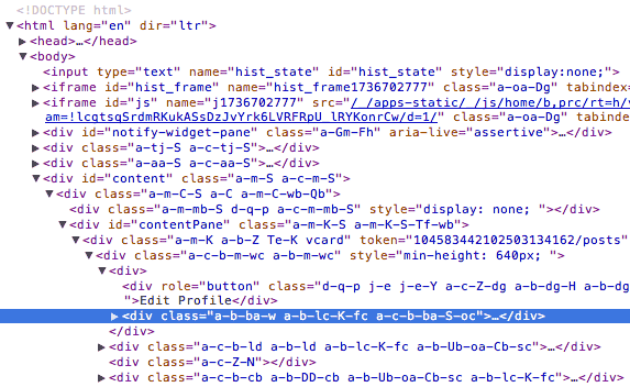
Is that code any better than the code that is generated by iWeb? It’s possibly worse. How can a company like Google who has incredibly talented developers end up with code like that? Well, in Google’s case it was written using a templating system that uses Closure, these templates are converted by java on the server into HTML(4). Nothing inherently wrong with that process but the end result is HTML that is machine-friendly but is not really intended to be easily readable by humans.
So it seems that with the ‘rise of the machines’ demonstrated by tools like Edge, Sencha and Hype along with development frameworks like those used by Google that there is a loss of focus on the best practices of clean code, graceful degradation, progressive enhancement, accessibility. Instead the focus is on easy generation of code and content, with Edge and Sencha giving a visual WYSIWYG-ish interface with which to create it, and Google’s Closure / Java dev process enabling code-savvy devs to write in a non-web native language and have this automatically generated or compiled into the final HTML and JavaScript.
(Of course a counter-argument is that clean semantic HTML code doesn’t apply to web apps as they are ‘more complex’ than ‘regular’ websites! That’s something for further discussion).
Change begins at home
So, is there a solution to this? Well, the first solution is to consider these issues yourself. If you’re evaluating tools like Edge, Sencha or evaluating development frameworks then pay close attention to the code they create. If it seems to be falling short then take the time to give feedback to the companies behind them. In the case of Adobe’s Edge tool which is currently an early preview release on Adobe Labs then there is an opportunity to give feedback on the app and influence it at an early stage of development. Don’t just whine about it on Twitter but take the time to give feedback and clearly explain what you think is wrong and how it can be improved.
Muse
Talking of people whining on Twitter, I wrote this article and had it all pretty much ready to publish when Adobe released another product on Adobe Labs, Muse. Although the main focus of this article is on the more interactive, dynamic flash-esque content creation applications that have been appearing I couldn’t really post this article without briefly mentioning Muse (I did mention iWeb and talk about Google+ after all, both of which obviously don’t fit that category of app).
Muse definitely renders Machine Generated Code as it’s sole aim is to enable visual designers to “Design and publish HTML websites without writing code”. I have to admit that the first thing I did when viewing the Muse website (which is itself built with Muse) was to view source, and sadly I was disappointed with what I saw there – lots of nested divs, generally bloated looking content, and despite purportedly being ‘HTML5’ there were no HTML5 structural tags to be seen.
Many WYSIWYG apps have come and gone and have never managed to produce good clean code without requiring the user to intervene and clean up code, this doesn’t mean it’s impossible to create such an app, but it’s definitely a big challenge. As with Adobe Edge I’d recommend taking time to give good, reasoned feedback about what you consider is wrong with the output it produces, don’t just complain about it on Twitter.
Christian Heilmann wrote an interesting article called “Getting rusty – we need new best practices for a different development world” which I think gives an interesting pragmatic perspective on the debate about Machine Generated Code and why we rightly consider clean, semantic code desirable as opposed to that produced by apps like iWeb, Edge, Hype, Muse etc. His final couple of paragraphs sum up the thoughts and feelings that inspired me to write this post:
“Using web standards means first and foremost one thing: delivering a clean, professional job. You don’t write clean markup for the browser, you don’t write it for the end users. You write it for the person who takes over the job from you. Much like you should use good grammar in a CV and not write it in crayon you can not expect to get the respect from people maintaining your code when you leave a mess that “works”.
And this is what we need to try to make new developers understand. It is about pride in delivering a clean job. Not about using the newest technology and chasing the shiny. For ourselves we have to understand that the only one who really cared about our beloved standards and separation of concerns is us – as we think maintainability and not quick deployment and continuous iteration of code. The web is not code – the web is a medium where we use a mix of technologies fit for the purpose on hand to deliver a great experience for the end users.”
Footnotes:
- 1: By post-Flash I mean as the only way to do interactive animated content on the web.
- 2: Animatable looks to be one of the most promising apps being developed as the team behind it have kept the whole concept of falling back to non-animated content as core to the way the app works, basing it on actual HTML content rather than just created through JavaScript.
- 3: I acknowledge that it is possible with recent versions of the Flash player to make Flash content that is more accessible, but generally Flash’s integration with Screen readers like Jaws etc is not great, and you have to specifically apply settings to the Flash content to help it be accessible.
- 4: This information about Google+ development and other interesting info from this thread.

 The Highland Fling 2011 Web Conference takes place on Friday 8th July at Symposium Hall, part of the Royal College of Surgeons in Edinburgh:
 In light of this disconnect between these two features in Safari I’ve been wondering if there is a deeper motivation for not blending the two together. If users had the capability to use a version of Reading List which automatically used the Reader function to strip content back then I wonder if publishers would complain that Apple was robbing them of page views / ad revenue or manipulating their content without consent?
 Both of these services allow you to upload your own music to the cloud so that you can play it back via various net connected devices.


 It seems like it was just a short while ago that I took this survey, but time flies and A List Apart’s "Survey for People Who Make Websites" is here again waiting for all those involved in designing and running websites to take the survey.
 Even though it’s not new to version 2 it’s worth mentioning that Cornerstone actually includes Subversion 1.4, 1.5 and 1.6 within the application itself. Although Mac OSX already includes Subversion having multiple versions right within Cornerstone itself means you can work with repositories that use different Subversion releases and also not have to worry about whether any OSX updates affect your existing Subversion repositories. This also helps to make sure that your local repository data is backed up via Apple’s Time Machine backup process too.