I wrote a post recently “Should WordPress block AI bots by default?” with some thoughts about whether WordPress should be blocking AI bots via the robots.txt file by default.
Since writing that I decided that rather than just talking about it I should go ahead and submit some updated code to the WordPress project that does exactly that. I’ve done WordPress development for 14+ years, whilst I’ve created my own plugins and added them to the WordPress plugin repository I’ve never submitted anything to the core codebase before, so it was an interesting process to go through to get a bit of experience of that.
I’m not going through the various steps in detail to do this, but basically it involves forking the WordPress codebase on Github, making the changes in a local development environment, pushing some code to Github and making a Pull Request for those changes.
Whilst the code change is pushed to Github you also need to make a ticket in WordPress Trac ticketing system that is used to track code issues like bugs, updates and feature requests. I created a new Trac ticket for the PR but as it turns out a similar idea had been previously suggested in this Trac ticket so mine has been marked as duplicate to this original one.
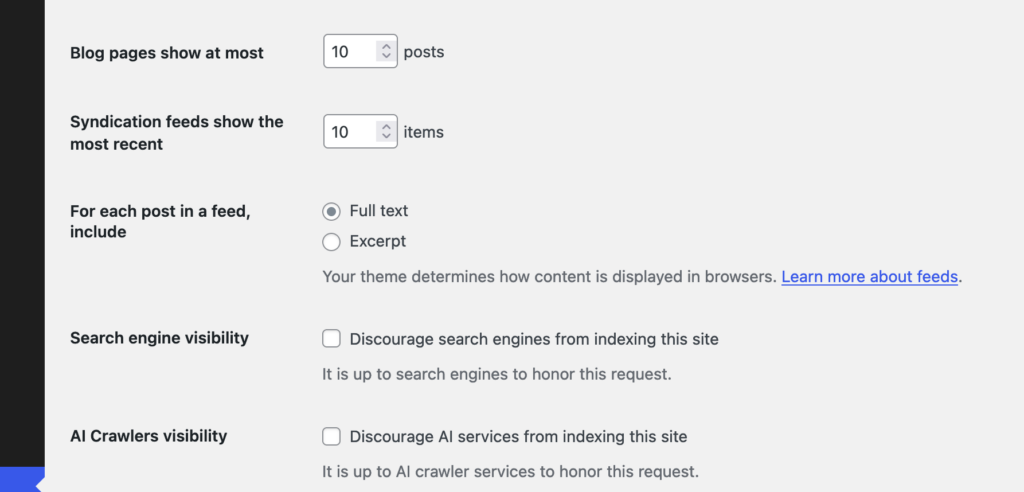
This original ticket has some good ideas in it, although no code has been written so I’m glad to have submitted a PR along with it. I do also think my argument for this are a bit more forceful in my ticket compared to the original, I really do think this should be added. However, I am approaching this from the perspective of trying to create some discussion around this, so I don’t at all expect that the code in my PR is exactly the way this feature should work. In the original Trac ticket the suggestion is to have another checkbox in the “Reading” options in WordPress, “Discourage Al services from indexing this site” which I think makes perfect sense.
I did wonder whether there should be any specific way to manage the list of AI Bots though, whilst the “discourage search engines…” option is similar there is a difference. In the ‘robots.txt’ file it only takes a couple of lines to block all search engine user agents:
User-agent: *
Disallow: /
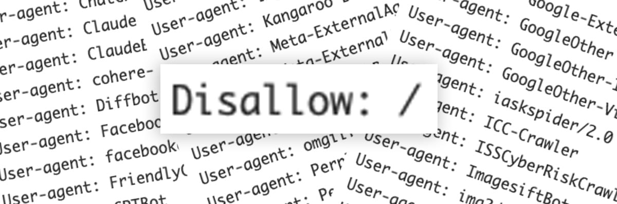
So if you wanted to block all search engines and AI bots you could use just those couple of lines, but presuming you still want search engines to index your site1 you need to specifically list all of the AI bot user agents to be blocked, something like this should block most known AI bots (at the time of writing in October 2024 anyway):
User-agent: AI2Bot2
User-agent: Ai2Bot-Dolma
User-agent: Amazonbot
User-agent: anthropic-ai
User-agent: AlphaAI
User-agent: Applebot
User-agent: Applebot-Extended
User-agent: Bytespider
User-agent: CCBot
User-agent: ChatGPT-User
User-agent: Claude-Web
User-agent: ClaudeBot
User-agent: cohere-ai
User-agent: Diffbot
User-agent: FacebookBot
User-agent: facebookexternalhit
User-agent: FriendlyCrawler
User-agent: GPTBot
User-agent: Google-Extended
User-agent: GoogleOther
User-agent: GoogleOther-Image
User-agent: GoogleOther-Video
User-agent: iaskspider/2.0
User-agent: ICC-Crawler
User-agent: ISSCyberRiskCrawler
User-agent: ImagesiftBot
User-agent: img2dataset
User-agent: Kangaroo Bot
User-agent: Meta-ExternalAgent
User-agent: Meta-ExternalFetcher
User-agent: OAI-SearchBot
User-agent: omgili
User-agent: omgilibot
User-agent: PerplexityBot
User-agent: PetalBot
User-agent: Scrapy
User-agent: Sidetrade indexer bot
User-agent: Timpibot
User-agent: VelenPublicWebCrawler
User-agent: Webzio-Extended
User-agent: YouBot
Disallow: /
It’s possible users might want to allow certain ones, and disallow others so the original Trac ticket also suggests that this list could be filterable so that plugins etc could modify this list.
I don’t think adding any kind of UI beyond the checkbox to core would be desirable as it’s exactly the kind of extension of functionality that plugins are intended for. The basic feature of blocking AI bots will work and if users need more they can find a plugin or write their own code to do what they need. One consideration is whether this list of default AI bots should get updated outwith the regular core WordPress development cycle, but the amount of new AI bots appearing probably(?) isn’t that frequent and there are fairly common interim point updates in the WordPress development cycle that would allow this block list to be updated.
If you’re reading this and think it’s an enhancement worth supporting then please do leave a comment on the original Trac ticket if you can, or reshare this post anywhere you think might help draw attention to it.
- I acknowledge there is a lot of discussion about whether blocking AI bots will one day have the same impact that blocking search engines from your site does now in that you basically won’t show in any search engine results. The intention of blocking AI bots by default is so that users can make an informed choice about how their content is used. ↩︎
- These are the droids we are looking for? ↩︎
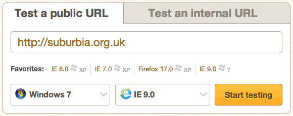
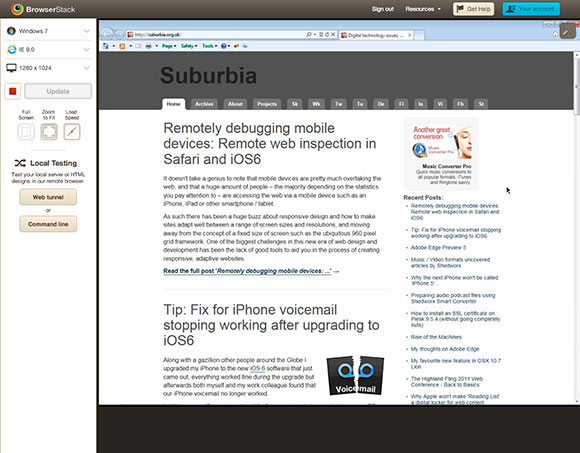
 Like many web design / developers I’ve made use of virtualisation applications like
 The ability to work in code and create media queries to handle various device widths and related styles has been possible for a while, but it can be a bit mind-melting trying to keep track of all of this and to test as you work through the development process. Fortunately we are now beginning to see a range of tools to help you develop responsive sites, one of the most recent being Adobe’s new
  Thankfully there are now tools being developed to allow remote access to the code running on the device itself, Adobe developed a tool codenamed ‘Shadow’ (now formally released as
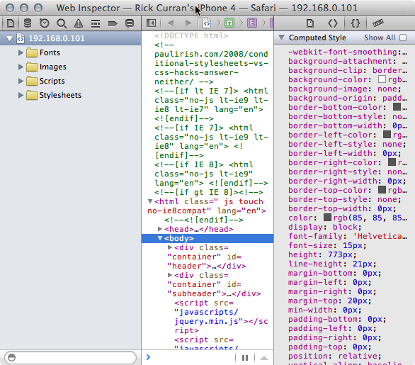
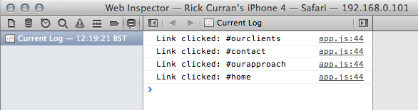
 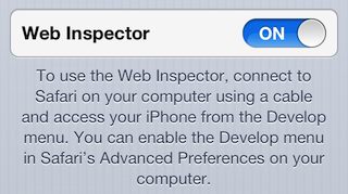 Fortunately the recent release of iOS6 offers a new feature that enables remote web inspection of mobile Safari on iPhone or iPad.
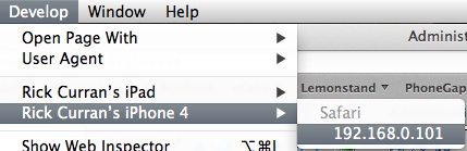
 The Highland Fling 2011 Web Conference takes place on Friday 8th July at Symposium Hall, part of the Royal College of Surgeons in Edinburgh: