Adobe Labs release Wallaby Flash to HTML5 converter

Adobe have released an interesting experimental tool called ‘Wallaby‘ over on Adobe Labs. It’s basically an app that tries to convert Flash FLA source files into ‘HTML5’ compatible animations. Note I’m using ‘HTML5’ in quotes as usage of the term here is more in the overall grouping of HTML5 and related technologies such as CSS3, JavaScript / jQuery, SVG etc. It’s worth reading over the Release Notes to get an idea of the current limitations, the biggest issues at the moment being WebKit browser support only and no conversion of actionscript or sound within FLAs.

I just happened to be playing around with Flash this morning messing around doing a little shape tweening with a couple of symbols I found over on The Noun Project website so I thought I’d use that FLA file and see how Wallaby coped with it.
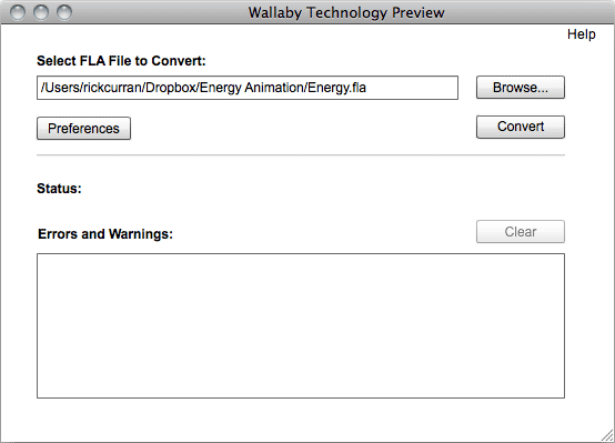
Running Wallaby:

After starting Wallaby you get a very simple interface, a file select field that you use to select the FLA file and a large Status area that shows any errors and warnings encountered whilst converting your file. There are also Preferences that can be set which at the moment include automatically opening the converted file in your default browser and enabling logging.

After selecting my FLA file I clicked ‘Convert’ and after a few seconds it happily converted my file without any errors or warnings. I was interested to see what it would make of the shape tweened animation that I had made in Flash as this seemed like quite a challenge to convert.

Wallaby’s HTML output:

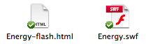
The conversion process results in quite a few files being exported as the animation is recreated using a combination of HTML, CSS and jQuery / JavaScript, here a screenshot of the files I got:

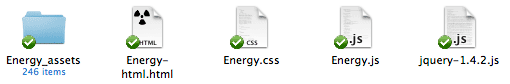
It turns out that to make an HTML version of our tweened FLA animation we need two JavaScript files, one CSS file, one HTML file and a folder containing 246 SVG frames. I think it’s fair to say that tweened animations are a bit of a challenge! Looking at the Release Notes it does state that it creates an SVG file for each frame of a shape tween. As a result the approximate sizes of the exported files look like this:

  • Energy-html.html: 75kb
  • Energy.css: 49kb
  • Energy.js: 2kb
  • jquery-1.4.2.js: 70kb
  • Energy_assets: 176kb

That’s a total of 372kb in order to recreate the tweened animation in HTML / CSS / JS / SVG.

Flash’s output:

So how does this compare with the files output by Flash? Well, not very well when you look at both the amount of files required and their file size:

  • Energy-flash.html: 2kb
  • Energy.swf: 4kb

A grand total of 6kb when it’s rendered as Flash swf output. That’s quite a difference in size, although admittedly Flash’s default HTML file doesn’t use any JavaScript such as SWFObject to embed the file which is generally common practice, so I would argue that the Flash output should really have the following additional SWFObject files added to it’s output:
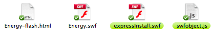
  • swfobject.js: 10kb
  • expressInstall.swf: 1kb

Even with that it’s still only a total of 17kb, about 1/20th the total size of the files that Wallaby outputs.

Why not use video instead?

This particular animation is obviously a challenge for Wallaby to convert into anything closely competing in file size, so perhaps in this case it would be a better option to use a video clip to provide a non-Flash version of the animation? The same animation can be output as an H.264 video at the same frame rate and it comes in considerably smaller at 192kb:

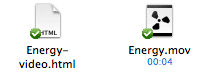
  • Energy-video.html: 1kb
  • Energy.mov: 192kb

That’s about half the size of the Wallaby output. It’s also likely to playback much better on mobile devices such as iPhone / iPad / iPod touch as Adobe warn that the output of shape tweened animation can result in playback performance difficulties on iOS devices.

In the interest of being consistent I should of course add some additional JavaScript video embedding option such as JWPlayer as again this is common practice when it comes to adding video on web pages. Using JWPlayer would add the following additional files:
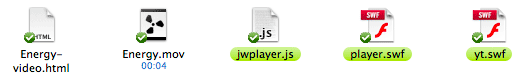
  • jwplayer.js: 104kb
  • player.swf: 96kb
  • yt.swf: 1kb

This adds 201kb to the total file size required so that brings it to about 393kb, almost the same as Wallaby’s HTML5 output. I’m sure there are possibly slimmer options compared to JWPlayer for embedding that could reduce that down a bit but I reference JWPlayer as I consider it to be one of the best cross-platform methods of embedding video on website.

Of course I haven’t mentioned anything about delivering video in alternative codecs such as Ogg Theora or WebM to serve browsers like Opera, Firefox and Chrome, this would further increase the files and sizes involved. However, given that Wallaby is trying to provide a way for animated content created in Flash to be output and made playable on devices such as the iPad and iPhone it could also be considered that providing any kind of Flash fallback for video is unnecessary, so we could ignore the JWPlayer / JS completely and just use the regular HTML5 <video> tag and a single H.264 video, so we’d be back to a considerably smaller size than Wallaby’s output in this instance.

In Closing…

Overall Wallaby looks to be a pretty handy tool for people that are struggling to find a way to get their content viewable on the millions of devices that don’t (and likely never will) run Flash. For animation that doesn’t involve shape tweening I think the resulting file sizes will be a lot more favourable and it will be a reasonably efficient way to create animated content using standards-based technology.

I would say that the primary target user for Wallaby, at least at first, is for people doing online advertising. This is an area that is seeing a lot of activity with tools like Sencha Touch appearing, there’s definitely opportunity for a ‘killer app’ that makes creating banner advertising using all of these new emerging web technologies in a way that people are used to doing in the Flash IDE. There’s a lot of challenges in there technically, as well as a lot of issues such as accessibility, graceful degradation etc, but I think a lot of companies are focusing on this challenge now, so it’s good to see that Adobe is thinking about various ways of providing tools for the job.

Sample Animation files:

I have included the HTML5 output as an iframe and also links to each animation in HTML5, SWF and H.264 formats. There is also a link to download all the assets of Wallaby’s output in a zip archive:

Wallaby’s HTML5 output:

View Wallaby’s HTML5 Output in new Window
Download the Wallaby HTML5 Assets as a Zip

SWF output:
View SWF Output in new Window

Video output:
View Video Output in new Window

Take A List Apart’s Survey for People Who Make Websites 2010

It seems like it was just a short while ago that I took this survey, but time flies and A List Apart’s "Survey for People Who Make Websites" is here again waiting for all those involved in designing and running websites to take the survey.

This survey, which has been running since 2007, was started with the intention of finding out:

"…who exactly our famous slogan, “for people who make websites,” was talking about. What were our kind of people’s salary ranges, titles, working conditions, educational backgrounds, gender, ethnicity, and so on? And what effect, if any, did one statistic have on another? For instance, did gender have an influence on salary? Was there a connection between educational background and job satisfaction? Did web professionals who worked at start-ups have the same titles as those who worked at universities and libraries?"

Over 30,000 people have taken the survey each year since then, so go read a bit more about it and then take the Survey.

You can also read the findings of last years survey which have been published online over at the A List Apart website.

Cornerstone 2 Subversion client

I wrote a blog post last year about Five Subversion Clients for Mac OSX where I highlighted some of the Subversion version control clients with a good GUI that are available for Mac OSX.

Out of all the clients I wrote about I ended up using the Cornerstone client the most (although Versions was a close second place). The makers of Cornerstone, Zennaware, have just released version 2 which introduces a whole load of new features and improvements to existing features.

SVN Workflow

My own SVN workflow is pretty straightforward as I am the only person that checks into my repositories. But Cornerstone 2 provides great tools for repositories with multiple users, finding out who checked in which files and why is clear and easy to find. One big improvement in V2 is with merging branches, this can be a pretty tricky process to manage but Cornerstone adds the ability to synchronise and reintegrate branches with their ancestor, deal with various revisions, and preview changes of any merges made.

Subversion 1.4, 1.5 & 1.6 inside…

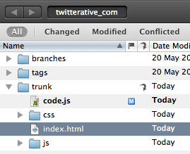
Even though it’s not new to version 2 it’s worth mentioning that Cornerstone actually includes Subversion 1.4, 1.5 and 1.6 within the application itself. Although Mac OSX already includes Subversion having multiple versions right within Cornerstone itself means you can work with repositories that use different Subversion releases and also not have to worry about whether any OSX updates affect your existing Subversion repositories. This also helps to make sure that your local repository data is backed up via Apple’s Time Machine backup process too.

Or work with external repositories

I don’t use any internal Subversion repositories myself though but instead host mine using Beanstalk who offer various pricing plans including a free plan. So if you work with external repositories then you can quite happily work with Cornerstone using your own external server or subversion host.

if you’re not using version control of any kind you should definitely give it a shot, Cornerstone makes the process a lot less daunting than having to work via the command line as well as offering a much more visual way to work with the changes and growth of your codebase.

How much does it cost?

Cornerstone 2 is out now and costs $59 for a single licence or $29 to upgrade from any previous version 1.x of the app. There is also a student discount of 20% which sweetens the deal even more.

You can also download a 14 day trial in order to check out the application for yourself before parting with any hard earned cash. Go to http://zennaware.com/cornerstone/ and click the download link to get the trial version, you can also buy Cornerstone directly from the Mac App Store.

[ Get 10% off your first month of Beanstalk Subversion hosting via this link:http://bnst.lk/eMqJVm ]

Dis-N-Gaged

Almost exactly seven years ago, before the launch of Apple’s iPhone and the ubiquity of the App Store, Nokia launched the N-Gage. The N-Gage was a combination mobile phone and gaming device that was intended to take on Nintendo’s Game Boy Advance.

The N-Gage (mk1 pictured below) was pretty much the first gaming phone and should really be considered a failed yet bold attempt to kick-start what is now a huge multi-billion dollar business globally. The N-Gage didn’t get the kind of success Nokia really hoped for despite the many millions invested in marketing. I actually liked this phone and did happily use it as both a phone and gaming device, although admittedly the main game I played was Tony Hawk’s Pro Skater! Combining a gadget with skateboarding is a sure way to catch my eye.

Sidetalkin’

The most obvious quirk of the phone’s design was that you had to hold the thin edge of it to your head to make calls, so it looked pretty comical! (Check out http://sidetalking.com/ !) Nokia subsequently brought out the ‘N-Gage QD’ which removed the side-talking feature and added a backlight and made it a bit smaller, as well as putting the game card slot on the outside instead of inside behind the battery!

The demise of the N-Gage started back in 2005 when the N-Gage as a hardware device ceased production leaving only N-Gage as a software component on various Nokia devices. However, September last year marked the final nail in the coffin (N-Gage 2003-2009: An Obituary) of the N-Gage when it was finished off completely.

As quirky as it looked, I think the N-Gage was an interesting concept which was ahead of its time – location-based multi-player networked gaming via bluetooth or over the internet via mobile-phone networks? Back in 2003? Who would ever be able to afford the data fees that the carriers would have charged you back then?!! Nokia spent a lot of money trying to make it a success, but the timing just wasn’t right for a device with those capabilities.

Nokia are really up against the wall these days with Apple’s iOS platform and the Android platform pushing the bar in both hardware and software capabilities. Although I’m a hardcore iPhone user I used to be a very happy Nokia user, the Symbian S60 OS integrated pretty well with my Mac. Once I got an iPhone of course that all ended, but I’ve still enjoyed using my various Nokia handsets such as the N80 and N95.

Pushin’ the envelope

Nokia do seem to be trying to find their feet in this changing mobile device landscape, certainly the Nokia N8 device has some great features, especially the 12MP camera which seems to produce some pretty spectacular photography.

Innovation like Nokia’s Push project also seems to demonstrate some of the same pioneering spirit behind the N-Gage, breaking new ground by exploring the use of mobile devices as part of our physical activities – of particular interest to me are the skateboarding and snowboarding prototypes (as I said earlier, a sure way to get me interested is to combine gadgets with skateboarding!).

I’m looking forward to seeing what comes out of these initiatives (I’d like to get my hands on either the skate or snow prototypes to play around with them!). For now I’ll just end with saying farewell to the Nokia N-Gage!

The V and A at Dundee Exhibition

Abertay University library are hosting an exhibition of the shortlisted finalists for the Architectural designs for the planned V&A Dundee building.

It’s really useful seeing some actual models of the buildings rather than just the rendered images and video that you can see on the website so it’s worth getting along there if you can.

I thought I’d post how I rank the six finalists, it’s quite a tricky decision really as there are interesting aspects to all of the designs:

1. REX

Basically I like this one best because of the visual impact it has, it looks impressive from the outside but also exposed those inside to the impressive views over the Tay. I think it would make a great feature at the waterfront and is obviously very different than any other planned buildings for the location.

The glass face and angles remind me of ice or icebergs which perhaps hints at Dundee’s history with south atlantic exploration, whaling etc.

The only unknown aspect of this design for me is how the glass panels will be connected, it’s not that apparent from the visuals or the model as they just appear to be huge panels of glass.

2. Snøhetta

This building is very different than the Kuma, completely understated in comparison to the Kuma and most of the other finalists. However, the Snøhetta design reveals itself more when you look into it, it is actually intended to rise and fall with the tide and will actually generate energy for use in the building.

I think it’s really important that whichever design is chosen it should really make the best use possible of renewable, sustainable energy sources such as solar, wind and tidal power. All three of which are available at the site of the building. Although this design has much less visual impact from the shoreline it actually looks great from the river itself.

3. Kengo Kuma

This was originally my favourite design, it has a big impressive aspect which is reminiscent of a ships bow and stern from certain angles, presumable this isn’t just me making it up and it is intentional! The light appearing through the horizontal strips of the buildings exterior is subtle and would look amazing at night time.

The biggest problem I see with this design is how it will look as time goes on, it looks to be the perfect seagull magnet with all of the horizontal beams of the structure presenting perfecting roosting locations for seabirds. An unfortunate clash with reality there for this design, I can’t see how they could prevent this from happening without resorting to prevention methods which would be both costly and unsightly.

Perhaps another issue is cost, I’ve read some comments that suggest it would be overly ambitious to achieve for the overall budget, we don’t want to see another Scottish Parliament style overspend.

4. Delugan Meissl

My initial reaction to this design was that it looked pretty crazy, like a spaceship had just touched down in the middle of a plaza. However, having looked at the model closeup I actually quite like the interior space.

It’s quite an unusual, imposing design (to say the least!) which definitely makes a statement. However, it’s perhaps a bit too off the wall. It’s also not very clear how the exterior finish will be done, it looks to have some form of translucency to it, almost like a see-through space shuttle with the black and white colour. I’m not sure if it’s a little bit too retro-futuristic.

One other concern with this design is how it will work with the forces of the wind, it can get a bit windy down on the river sometimes – will there be some unexpected wing effect? It’s an interesting concept and the interior offers space which would definitely be very functional and would work well for gallery space etc, perhaps better than some of the other designs. Overall, perhaps it’s a bit too "Take me to your Leader" to be in the running.

5. Steven Holl

I’m now getting to my least favourite of the designs. I’m pretty unimpressed by this design overall, partly due to the renderings of it just being quite vague. It looks quite indistinct and hazey, like the Meissl design I can quite see how the surface of the building will look or function – is it glass or a cloth-like material?

The renderings showing this design against the backdrop of Dundee really didn’t work for me either, it just didn’t look good. Overall the renderings make it look like a building that’s only half there – like a building that is trying to appear from another dimension but can’t quite make it all the way.

It really just looks quite non-distinct, you can see from the rendering to the right that it just merges in with the grey-ish clouds they’ve depicted in it, all of the other renderings are the same. Perhaps if they’d presented it in nice bright sun light it would have a better impression upon me. Dundee is considered to be the sunniest city in Scotland so at least presenting it in that light would help.

6. Sutherland Hussey

Last in my ranking is unfortunately the design by the only Scottish architect practice. My initial impression is that it is just too boxey, especially in comparison to the other finalists.

It just doesn’t seem organic in anyway, I don’t mind the main aspect of the building to some extent but it’s the surrounding vertical columns of the pier it’s set on that further add to the rigid box-like appearance. Perhaps if it was on a softer, smooth landscaped environment then the simple box shape of the building would make an interesting juxtaposition?

So unfortunately it’s last in my ranking, although I’d say it’s probably tied with number 5 though, the more I look at number 5 I would perhaps be tempted to swap them over, but I’ll leave it as they are for now.

~ ~ ~ ~

What I’m really interested to hear about for all the designs is the type of materials, the use of renewables etc. The location provides great opportunity to make use of things like vertical axis wind turbines and tidal power generation, Dundee hopes to be at the forefront of renewable energy technology so these buildings should walk the talk too.

You can view more about all 6 finalists over at http://vandaatdundee.com/your-future/shortlist/.

Review: Amazon Kindle

I got a chance to play around with a Kindle e-Reader device yesterday (my Mum bought one!). It’s quite a neat little device that works brilliantly for it’s main purpose: reading things.

The screen seems almost fake when you first see it as it doesn’t look like a normal screen, it almost looks as if it was printed on. It’s actually really great for reading though.

The weirdest thing for me is that I just want to tap on the screen to interact with it after being so used to that with my iPhone.

There’s an experimental web browser on it which is usable albeit a bit clunky due to the lack of touch screen, it’s great for reading text-based content though so it’s handy if you just want to read some stuff online.

Although people have tried to compare the Kindle to Apple’s iPad, I wouldn’t say that it is a competitor at all, I think it’s more like the original iPod which was created with one function: ‘listening to stuff’, but the Kindle’s one function is: ‘reading stuff’!

Overall I’m pretty impressed with it as a reading gadget, I could probably see myself getting one for at home. It just remains to be seen whether the rumours of a 7" variation of the iPad have any truth behind them, the touch screen benefits of a device like that could win out if it can be close to the light weight of the Kindle too!

My 10K Apart Competition Entry

An Event Apart have been holding an interesting little web app competition recently called 10K Apart. The simple premise is that the source code of the site had to be 10kb in size!

I thought that this would be an interesting challenge and set about refactoring my Twitterative app that I built a while ago, after quite a lot of stripping out of unnecessary tags and images I managed to get it down to just under 10kb.

I submitted my app just before the competition closed so I don’t know if it will get many votes from people but it was still fun to really dig in and make something as small as it can possibly be.

My entry can be viewed over on the 10K Apart site via this url:

http://10k.aneventapart.com/entry/details/339

Screenshot of Twitterative app

WordPress Answers Public Beta

WordPress Answers BetaWordPress Answers is a StackExchange Q&A site which has just gone into public beta. If you develop WordPress themes or plugins and generally get your hands dirty with WordPress stuff you’re going to want to go and check it out.

If you’ve never used any of the StackExchange sites (one of the most well known being Stackoverflow) then I think you’ll find that they provide a really good environment for asking questions if you’re in need of help. I’d encourage you to get involved and try and help answer other people’s questions, there’s more and more being asked and you just might be the person who’s written a piece of code or tried out a plugin that will help somebody solve their problem!

Review: ‘You Gotta See This!’

"You Gotta See This!" is a photography app by Boinx software for the new iPhone 4 which makes use of the gyroscope feature to quickly capture panographic images.

It’s a pretty fun app to use to capture some unusual images. You just press the button and it starts to record images as you move around the scene you’re trying to take photos of and then it overlays all the captured images rendered as one big image which can rendered using several themes.

You can then post these themes to Facebook, Twitter etc and save them to the camera roll on the iPhone.

if you’ve got an iPhone 4 it’s a cheap (£1.19) little app that makes use of the new hardware features offered by the iPhone 4. Here’s a few more sample images made using it:

Photoshop CS5 Content Aware Fill experiments

I posted these examples of Photoshop CS5’s new Content Aware Fill function to my Flickr account a few weeks ago but I thought I’d post them here too.

I’ve just started exploring all of the apps in the CS5 Master Collection so I might post a few other experiments from Photoshop and other apps as well. Click on the images to view a larger version.

Child / No Child

Cows / No Cows

Skater / No Skater