Mental note: Set ‘register_meta’s ‘single’ parameter appropriately or you end up with data across multiple custom fields

This is a mental note for my own future reference after spending several hours trying to debug why some data was getting magically broken apart into multiple meta data fields.

In this case I was submitting a string of JSON data (created using JSON.stringify) via $.ajax in jQuery to create a ‘user_meta’ field via the WP Rest API. I could see from the response after successfully posting that the data was breaking up into multiple parts and was showing up as an array in the Ajax response, sure enough looking at the data in the WordPress ‘user_meta’ table I could see that there were a whole load of entries created from pieces of the single string I had sent.

After searching online for solutions and trying quite a few things I managed to narrow it down to which bit of code might be the cause, I was struggling to figure out whether it was happening during the AJAX request or on the server within WordPress.

However, I was aware that when rendering meta data using ‘get_user_meta‘ or ‘get_post_meta‘ that it will bring up an array as the default format as it is possible to have multiple meta fields with the same name, so when requesting a meta field you can set the ‘$single’ parameter to ‘true’ and this will return only a single value.

However, I hadn’t realised that you can actually specify that the fields are only to ever have a single instance when you register them using ‘register_meta‘, after setting this parameter my submitted JSON string happily went into a single user_meta field!

You can set the meta field to use a single parameter when registering like so:

register_meta( 'user', 'my_meta_fieldname', array( 'type' => 'string', 'single' => true ) );

Hopefully this will stay in my head now and I’ll remember if this happens again!


Remotely debugging mobile devices: Remote web inspection in Safari and iOS6

It doesn’t take a genius to note that mobile devices are pretty much overtaking the web, and that a huge amount of people – the majority depending on the statistics you pay attention to – are accessing the web via a mobile device such as an iPhone, iPad or other smartphone / tablet.

As such there has been a huge buzz about responsive design and how to make sites adapt well between a range of screen sizes and resolutions, and moving away from the concept of a fixed size of screen such as the ubiquitous 960 pixel grid framework. One of the biggest challenges in this new era of web design and development has been the lack of good tools to aid you in the process of creating responsive, adaptive websites.

Media Queries and Responsive Design

The ability to work in code and create media queries to handle various device widths and related styles has been possible for a while, but it can be a bit mind-melting trying to keep track of all of this and to test as you work through the development process. Fortunately we are now beginning to see a range of tools to help you develop responsive sites, one of the most recent being Adobe’s new Edge Reflow tool which is an app that lets you visually adjust the viewport and tweak the CSS of various media queries. It’s a simple, focused app that lets you resize the viewport and tweak the styles as you go. At the time of writing it hasn’t been released yet but when I get a chance I will definitely be checking it out and writing something about it.

Remotely Debugging Code on Mobile Devices

Another challenge with working with mobile devices is that you really need to test on actual mobile devices to get an understanding of the true behaviour of them. Although you can set the width of your desktop browser to be the same as that of an iPhone it won’t necessarily behave exactly the same way due to the differences in the way the browsers handle CSS or JavaScript.

One of the difficulties in testing on devices themselves is that it’s not very easy to debug when things don’t work as expected. On a desktop browser such as Safari you can use the Web Inspector to see the live code as you interact with it and also see any JavaScript errors that are triggered, but on a mobile browser there is often little available to help you detect the errors.

Thankfully there are now tools being developed to allow remote access to the code running on the device itself, Adobe developed a tool codenamed ‘Shadow’ (now formally released as Edge Inspect) which works by providing apps for various mobile devices such as iPhone, iPad, Android phones and tablets.

With these apps installed on your devices you then run a desktop app on your computer as well as an extension in Google Chrome. You can then view websites in Chrome and they will be simultaneously displayed on the mobile devices running the apps, but the key feature is that you can remotely inspect the HTML, CSS and JavaScript running in the app on those devices. A really excellent tool.

Remotely Debugging in Safari

Adobe Edge Inspect (formerly Shadow) is a great tool, but what if, like me, you prefer to work in desktop Safari as your main browser and don’t want to or can’t use Chrome to test sites? In case anyone thinks this is just down to a matter of personal preference of browser I can give a legitimate example of why having to use Chrome can be a problem – Chrome’s in-built support for Flash gets in the way of testing content that is intended as fallback or alternative content on the desktop.

Screenshot of Web Inspector settings in iOS6 on an iPhoneFortunately the recent release of iOS6 offers a new feature that enables remote web inspection of mobile Safari on iPhone or iPad.

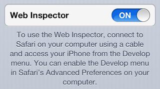
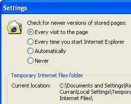
To make use of it you need to go into the ‘Settings’ app on your iOS device, and drill down into ‘Safari->Advanced’ where you’ll find a new toggle button for ‘Web inspector’, (this replaces the old ‘Debug’ option in mobile Safari which really offered little functionality).

Switch this on and you’ll see a small paragraph of text appearing which explains that you need to connect your device to your computer with a cable for this feature to work.

Once you’ve enabled Web Inspector on your iOS device(s) then you should find them listed in the Develop menu in Safari on your computer, it should looks something like this:

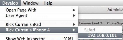
You can select the device and then it opens up a menu showing the available applications that web inspector can open. Note that you need to have mobile Safari open on your iOS device for any sites to be listed in the menu, if they’re not open then you’ll get a message saying ‘No Inspectable Applications’.

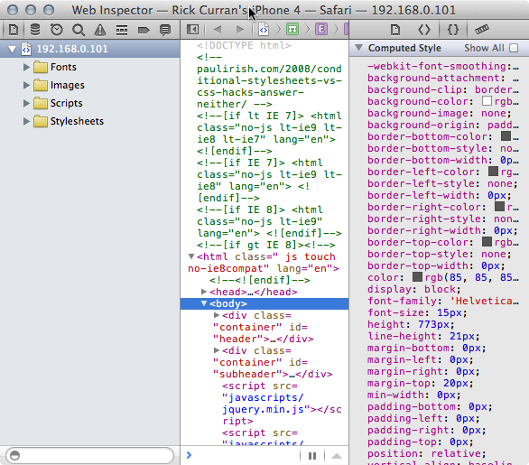
Once you select a site from the menu then the familiar Web Inspector window in Safari on your computer will open, the difference is that you are seeing the HTML, CSS and JavaScript from your iOS device. You can then browse around and interact with the site on your iOS device and inspect all of the changes occurring right in Web Inspector. Here’s a view of the HTML from a site on my iPhone:

Debugging via the console remotely

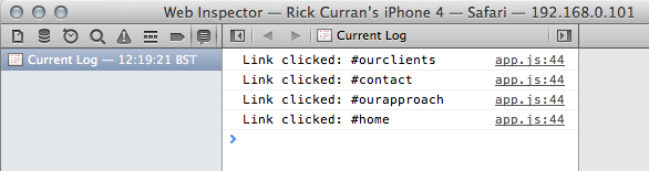
Just as with the ‘regular’ web inspector you can interact, view and update HTML and CSS and then see these temporary tweaks appear right on your iOS device. The main benefit in debugging for me has been in dealing with JavaScript / jQuery code, I can make use of console.log messages and debug via the console just as I would when working on my computer:

In a recent jQuery mobile based site I was developing I encountered code that was failing in mobile Safari but working fine in Safari on my Mac – exactly the kind of situation I mentioned earlier in this article where code is handled differently in mobile Safari. But thanks to this new remote web inspector functionality I was able to easily add some console messages and figure out what was going on and adjust the code to work around the problem.

A Great Solution for iOS Web Development and Testing

iOS6’s remote web inspection functionality is definitely a huge improvement if you are making sites that you need to test on iOS devices. With the increase in Android-based devices such as Google’s Nexus 7 and Amazon’s Kindle Fire tablets you will of course need to test on other devices besides iPhones and iPads. So tools like Adobe’s Edge Inspect are definitely something you will need to make use of too for testing across the various platforms and devices, but the simplicity of this iOS-specific testing workflow is very easy to set up and work with. A definite two-thumbs up from me!

I’m going to take a look at some of the other tools available to aid in the contemporary web development workflow of responsive, mobile-friendly design and write some more posts about them soon. In particular an updated look at Adobe’s Edge Animate tool and also a look at the Edge Reflow tool once it has been released.

Adobe Edge Preview 5

I wrote a post "My thoughts on Adobe Edge" back in August last year which looked at Edge Preview 1 where I was mainly interested in seeing how the output of Edge compared with Flash in capability, size and efficiency.

Since then Adobe have been regularly updating the Preview releases for Edge and have just released Adobe Edge Preview 5, since the initial Preview 1 release – which was pretty bare bones in regard to functionality – they have added a lot of new functionality.

In particular two things I’m pleased to see in Preview 5 are "Publish to Web" which brings code minification and "Down-level Stage for non-HTML5 Browsers" which provides a way to set fallback content for non-HTML5 browsers:

  • Publish to Web — Optimize your content for deployment by specifying if jQuery should be packaged with the composition, or downloaded from a CDN to improve caching.Edge also transforms the _edge.js file, and minifies both the _edge.js and _edgeActions.js files, resulting in significantly smaller files.
  • Down-level Stage for non-HTML5 Browsers — Use the new down-level stage to design static (non-animated) compositions that are compatible with older non-HTML5 browsers such as Internet Explorer 8 and below.

It’s good to see the minification capabilities added as this definitely helps deal with the size issue that I highlighted in my Preview 1 post. I think there’s probably still a load of work to do in minimising file sizes as this is especially important for mobile devices.

I’m keen to see what new features are added in future Preview releases, one issue is in regard to responsive web layouts and how content created in Edge can possibly adapt to the dimensions of the device / browser window that it is viewed in, again for mobile access this is very important.

One other feature that would be very good is some way to reproduce the masking capabilities that is possible in Flash, in particular the ability to apply a non-square mask over some content. It is possible to clip content but this uses rectangular clipping by limiting the overflow of a containing div to be hidden. I can’t see how non-square cropping would be possible with the limitations of current CSS3 capabilities, I’d happily be proven wrong on this though.

Here’s a preview video published on Adobe TV which introduces the updated features in Beta 5:

My thoughts on Adobe Edge

Today Adobe published on their Adobe Labs website a public preview of a new application called Edge, which is described in their own words as:

"Adobe® Edge Preview is a new web motion and interaction design tool that allows designers to bring animated content to websites, using web standards like HTML5, JavaScript, and CSS3."

Having previously done a little comparison between the output contents and file size of their previously released Wallaby ‘Flash to HTML5’ conversion tool and that of Flash itself then I thought it would be good to do the same thing for Edge. However, the problem at the moment is – being only the first preview release – Edge has a fairly limited featureset with animation methods such as rotation, location (X / Y axis movement), opacity, scaling and skewing. Essentially some of the basic animation tools that you’d find in Flash. The problem with trying to do a comparison along the lines of the Wallaby test that I did is that I used a shape-tweened animation for that test, something which just isn’t possible at this time within the capabilities of Edge.

So, in lieu of being able to do a really exact comparison I have instead made a simple animation using one of the original SVG source graphics that I used for my Wallaby test. The main outcome of doing this test is just to see what the output of Edge is like – how many files does it create, how big is each file individually and in total. If you haven’t read the previous Wallaby post prior to this then in a nutshell the Flash output was far more efficient in both number of files and file size. Again it has to be said that a shape-tween animation is probably the most complex type of animation you could aim to do in this context, so I did set the bar fairly high there. But as tools like Edge and Wallaby are an attempt to try and bring Flash-esque timeline based animation creation to the world of HTML5/CSS/JS/SVG then it’s fair to expect that beyond some simple x/y movement and rotation that shape-tweening is something that people – especially those from a Flash background – will want to create.

‘Edge Case’ sample: Rotating an SVG in Adobe Edge

So, here’s the simple animation I created in Edge. I imported an SVG file which I had used for the Wallaby test and applied a simple 360 degree rotation to it, a lot simpler than the Wallaby test but I thought it was worthwhile bringing in an SVG file to see what Edge did with it.


View Edge’s Output in new Window
Download the Edge Assets as a Zip

Adobe Edge’s ouput HTML, CSS, JS etc

Here are all the files that Edge created for this example:

  • edge-case.html: 1kb
  • edge_includes/jquery-1.4.2.min.js: 72kb
  • edge_includes/jquery.easing.1.3.js: 8kb
  • edge_includes/edge.0.1.1.min.js: 32kb
  • edge_includes/edge.symbol.0.1.1.min.js: 29kb
  • edge-case_edge.js: 5kb
  • edge-case_edge.css: 1kb
  • images/noun_project_182.svg: 1kb

Total: 149kb

So, to get that basic rotation animation of an SVG file we get almost a 150kb payload in order to make that work. I haven’t bothered creating a Flash (or video) version of this animation as I think it’s fairly clear that it would be possible to get a smaller file size using Flash to create it. Edge and tools like it have obviously got their work cut out here, especially with the huge use of mobile devices then file sizes and number of separate files in a site (i.e. minimising server calls etc) is an important issue.

We’ve definitely got to cut Edge some slack though here, as small as Flash files can be it’s important to remember that the entire runtime for Flash is a plugin whereas as HTML / CSS / JS etc is supported by the browser’s native features, Also the JS files used by Edge are providing a kind of runtime in the form of some Javascript functions which gets added to every animation that you create with it. Presumably this could be alleviated by having this file be published only once and then referenced, or better yet by being hosted by Google’s CDN and referenced that way along with jQuery which Edge also includes with each animation.

Adobe Edge: Just a tool for Flash-ers or true HTML based creation?

It’s hard to say at this point how these tools will be used, a big area will surely be a replacement for Flash-based interactive / animated advertising, again file size is very important here as Flash banner ads often have a maxmimum payload for ad networks of about 40kb, so Edge is not competitive here.

I think my biggest concern about these tools is that they simply become a swap-in replacement for Flash and that people start to use them purely from a visual perspective and not considering the structure and semantic meaning which underlies all HTML pages. It is *HTML*5 after all, even though that term is often used as a buzzword to include JavaScript effects, technologies such as Canvas, SVG etc. It is extremely important to remember that semantic meaning is at the core of HTML. As such animations created with tools like Edge should keep that at heart and include a workflow that encourages this fact, not just enabling ways to make things move around the screen etc. So I’ll be interested to see how things progress with Edge.

Despite that concern it is still great to see tools like Edge and Sencha Animator being released, the uptake of complex JavaScript based interaction and animation is certainly hindered most by the lack of capable IDE’s to make the process quicker to do. Hand coding jQuery animation and interaction is fine but a good IDE would enable you to keep on top of the code being used but also make it much quicker and efficient to develop using these technologies.

Anyway, that’s my thoughts having played around with Edge, I’ll have to go catch up with some reading online and see what other people are saying, feel free to comment with your own thoughts!

Adobe Labs release Wallaby Flash to HTML5 converter

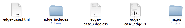
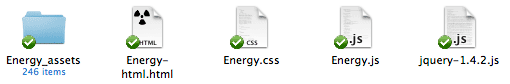
Adobe have released an interesting experimental tool called ‘Wallaby‘ over on Adobe Labs. It’s basically an app that tries to convert Flash FLA source files into ‘HTML5’ compatible animations. Note I’m using ‘HTML5’ in quotes as usage of the term here is more in the overall grouping of HTML5 and related technologies such as CSS3, JavaScript / jQuery, SVG etc. It’s worth reading over the Release Notes to get an idea of the current limitations, the biggest issues at the moment being WebKit browser support only and no conversion of actionscript or sound within FLAs.

I just happened to be playing around with Flash this morning messing around doing a little shape tweening with a couple of symbols I found over on The Noun Project website so I thought I’d use that FLA file and see how Wallaby coped with it.

Running Wallaby:

After starting Wallaby you get a very simple interface, a file select field that you use to select the FLA file and a large Status area that shows any errors and warnings encountered whilst converting your file. There are also Preferences that can be set which at the moment include automatically opening the converted file in your default browser and enabling logging.

After selecting my FLA file I clicked ‘Convert’ and after a few seconds it happily converted my file without any errors or warnings. I was interested to see what it would make of the shape tweened animation that I had made in Flash as this seemed like quite a challenge to convert.

Wallaby’s HTML output:

The conversion process results in quite a few files being exported as the animation is recreated using a combination of HTML, CSS and jQuery / JavaScript, here a screenshot of the files I got:

It turns out that to make an HTML version of our tweened FLA animation we need two JavaScript files, one CSS file, one HTML file and a folder containing 246 SVG frames. I think it’s fair to say that tweened animations are a bit of a challenge! Looking at the Release Notes it does state that it creates an SVG file for each frame of a shape tween. As a result the approximate sizes of the exported files look like this:

  • Energy-html.html: 75kb
  • Energy.css: 49kb
  • Energy.js: 2kb
  • jquery-1.4.2.js: 70kb
  • Energy_assets: 176kb

That’s a total of 372kb in order to recreate the tweened animation in HTML / CSS / JS / SVG.

Flash’s output:

So how does this compare with the files output by Flash? Well, not very well when you look at both the amount of files required and their file size:

  • Energy-flash.html: 2kb
  • Energy.swf: 4kb

A grand total of 6kb when it’s rendered as Flash swf output. That’s quite a difference in size, although admittedly Flash’s default HTML file doesn’t use any JavaScript such as SWFObject to embed the file which is generally common practice, so I would argue that the Flash output should really have the following additional SWFObject files added to it’s output:

  • swfobject.js: 10kb
  • expressInstall.swf: 1kb

Even with that it’s still only a total of 17kb, about 1/20th the total size of the files that Wallaby outputs.

Why not use video instead?

This particular animation is obviously a challenge for Wallaby to convert into anything closely competing in file size, so perhaps in this case it would be a better option to use a video clip to provide a non-Flash version of the animation? The same animation can be output as an H.264 video at the same frame rate and it comes in considerably smaller at 192kb:

  • Energy-video.html: 1kb
  • Energy.mov: 192kb

That’s about half the size of the Wallaby output. It’s also likely to playback much better on mobile devices such as iPhone / iPad / iPod touch as Adobe warn that the output of shape tweened animation can result in playback performance difficulties on iOS devices.

In the interest of being consistent I should of course add some additional JavaScript video embedding option such as JWPlayer as again this is common practice when it comes to adding video on web pages. Using JWPlayer would add the following additional files:

  • jwplayer.js: 104kb
  • player.swf: 96kb
  • yt.swf: 1kb

This adds 201kb to the total file size required so that brings it to about 393kb, almost the same as Wallaby’s HTML5 output. I’m sure there are possibly slimmer options compared to JWPlayer for embedding that could reduce that down a bit but I reference JWPlayer as I consider it to be one of the best cross-platform methods of embedding video on website.

Of course I haven’t mentioned anything about delivering video in alternative codecs such as Ogg Theora or WebM to serve browsers like Opera, Firefox and Chrome, this would further increase the files and sizes involved. However, given that Wallaby is trying to provide a way for animated content created in Flash to be output and made playable on devices such as the iPad and iPhone it could also be considered that providing any kind of Flash fallback for video is unnecessary, so we could ignore the JWPlayer / JS completely and just use the regular HTML5 <video> tag and a single H.264 video, so we’d be back to a considerably smaller size than Wallaby’s output in this instance.

In Closing…

Overall Wallaby looks to be a pretty handy tool for people that are struggling to find a way to get their content viewable on the millions of devices that don’t (and likely never will) run Flash. For animation that doesn’t involve shape tweening I think the resulting file sizes will be a lot more favourable and it will be a reasonably efficient way to create animated content using standards-based technology.

I would say that the primary target user for Wallaby, at least at first, is for people doing online advertising. This is an area that is seeing a lot of activity with tools like Sencha Touch appearing, there’s definitely opportunity for a ‘killer app’ that makes creating banner advertising using all of these new emerging web technologies in a way that people are used to doing in the Flash IDE. There’s a lot of challenges in there technically, as well as a lot of issues such as accessibility, graceful degradation etc, but I think a lot of companies are focusing on this challenge now, so it’s good to see that Adobe is thinking about various ways of providing tools for the job.

Sample Animation files:

I have included the HTML5 output as an iframe and also links to each animation in HTML5, SWF and H.264 formats. There is also a link to download all the assets of Wallaby’s output in a zip archive:

Wallaby’s HTML5 output:

View Wallaby’s HTML5 Output in new Window
Download the Wallaby HTML5 Assets as a Zip

SWF output:
View SWF Output in new Window

Video output:
View Video Output in new Window

How to fix flashing background images in Internet Explorer 6

In the process of using jQuery on a website revamp I encountered a problem I’ve experienced once before – flashing background images when using jQuery hovers in IE6. It turns out the problem is that IE6 does not cache images properly.

If you’re a web developer then you have probably set IE6’s Internet Options to check for newer version of stored pages every time you visit it in order to see all the incremental changes you make during testing / debugging. If that’s the case then you’re very likely to encounter the IE 6 flashing background problem. A typical situation would be using jQuery hover code on an element with a background image specified in the CSS. In this situation you may find that each time you hover over an element the image is reloaded resulting in a flashing effect in IE6.

One solution to this problem is to change the default of ‘automatically’, however, you have no way of knowing if the end users of your site will have the same settings so it’s possible they experience the same issue.

Upon hitting this issue recently I endeavoured to find a solution rather than adapting my HTML / CSS to fix it as I have done in the past. I also knew that IE6 users would be reasonably common for my client ‘s potential website user base so it needed fixed one way or the other. A bit of googling came up with an article entitled “Dear IE6: Please Cache my Images.“, the article’s solution was a bit of jQuery code that makes use of a specific IE javascript command to force background images to stay cached regardless of settings used in Internet Options:

if(jQuery.browser.msie && parseInt(jQuery.browser.version, 10) == 6) {   try {     document.execCommand("BackgroundImageCache", false, true);   } catch(err) {} }

Add this code to your page and it will fix the flashing image issue with hovers in IE6! Quite a simple solution to an annoying problem that has previously caused me to change my HTML code to fix, I’m glad that I decided to Google a solution this time!

One other thing to keep in mind that is pointed out in the aforementioned article is that this script will enable the caching in IE6 until you quit the browser and restart it so it will affect all sites that you visit in IE6.

Essential Reading for Web Designers – Second Edition

I wrote a post back at the end of 2005 called "Essential Reading for Web Designers" in which I wrote about a few books that I considered essential reading for anyone who does website design. Primarily these books focused on using web standards, at the time these books were the few key books about this subject.

Since then a lot more books have been written but the books I wrote about then are still very important. In fact two of them have been updated with a second edition bringing them right back up to date with the current state of web design. As these second editions have come out I thought I’d make a second edition of my own and update my list of essential reading too!

Cover image of Design with Web Standards - 2nd Edition
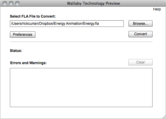
Designing with Web Standards – Second Edition by Jeffrey Zeldman

This second edition by an author who was recently called ‘The King of Web Standards’ in a recent interview on BusinessWeek.com brings this key book up to date. the back cover states:

Best-selling author, designer, and web standards evangelist Jeffrey Zeldman has updated his classic, industry-shaking guidebook. This new edition, now in full color, covers improvements in best practices and advances in the world of browsers since the first edition introduced the world to standards-based design.

View Designing with Web Standards – Second Edition on Amazon.

Cover image of Bulletproof Web Design 2nd EditionBulletproof Web Design: Improving flexibility and protecting against worst-case scenarios with XHTML and CSS, Second Edition by Dan Cederholm

This second edition, due for release in September 2007, updates this excellent book. Dan writes about it on his own website saying:

This isn?t a giant update nor a new book entirely. Rather, it brings the examples in line with Internet Explorer 7 (which wasn?t released when the first ed. was published) and adds several more examples based on ems (which were sorely lacking from the original book). There are of course errata fixes and nips and tucks throughout as well, and about 30 additional pages were added in total.

View Bulletproof Web Design: Improving flexibility and protecting against worst-case scenarios with XHTML and CSS, Second Edition on Amazon

Cover image of DOM ScriptingDOM Scripting: Web Design with JavaScript and the Document Object Model by Jeremy Keith

This book focuses on best practices for Javascript coding. It’s a great book aimed at web designers rather than programmers so it’s an excellent way to get into the power that the DOM and Javascript can offer:

The book is aimed at designers rather than programmers. If you’ve learned the benefits of Web Standards through CSS and you’re now ready to move on to the next level, this is the book for you. It will show you how to add stylish, usable enhancements to your web pages using Web Standards that guarantee future compatibility.

View DOM Scripting: Web Design with JavaScript and the Document Object Model on Amazon.

Cover image of Bulletproof AJAXBulletproof Ajax by Jeremy Keith

Following on from DOM Scripting, Jeremy Keith writes further about best practices in Javascript programming. This book focuses on how to use AJAX but in a way that degrades well and is accessible:

Using flexible design elements that adapt to the user?s needs, Web sites continue to work beyond the typical browsing environment. I believe that the same philosophy can be applied to Ajax. Far too many Ajax applications are built like a house of cards, dependent on just the right stack of technologies in the browser. Browsers that don?t support the required technologies are locked out and their users are turned away. To avoid this, you need to create flexible applications using bulletproof Ajax.

View Bulletproof Ajax on Amazon.

And many more…

These are just a few books on these subjects, but they are a few that I would definitely recommend reading, and probably in the order I’ve listed them too. A quick look on Amazon (or in my Amazon aStore found under the ‘Store’ section above) will find many other books to take your web design and development further.

~Rick