I have been working with WordPress since around 2010 and since that time I have almost exclusively used it as the underlying basis for various web projects I’ve developed for myself and clients. From design festival websites, to a skatepark directory, to an online learning toolkit, I’ve used it for various projects both large and small.
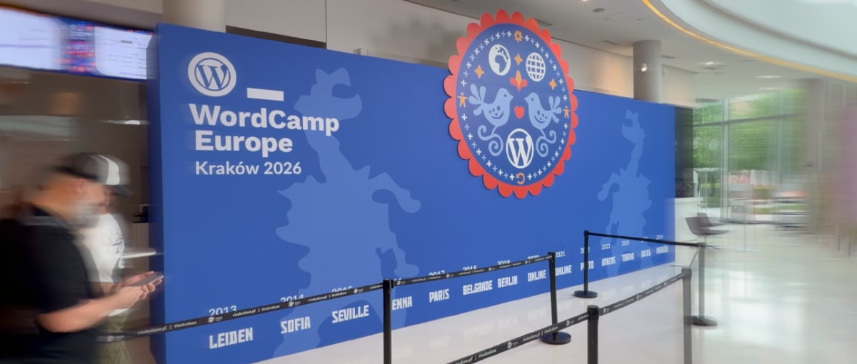
Despite working with WordPress for over fifteen years, I had never attended one of the larger WordPress conferences. When I realised WordCamp Europe 2026 was taking place in Kraków, it seemed like the perfect opportunity to experience my first WordCamp.
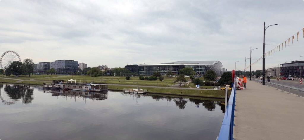
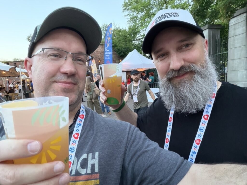
It was a bit of a whirlwind trip, flying in late Thursday, the conference on Friday & Saturday and then flying out early Sunday morning. So not anywhere near enough time to see that much of Kraków outside of the conference but, along with my friend Graeme, we did manage a little sight-seeing in the evenings, exploring the general old town area (much of it via Bolt scooters!).
There was a lot to take in over the trip, so here are a few things that stood out at WordCamp Europe 2026.
Accessible and affordable
Many creative industry / web design / development conferences are quite expensive to attend, as someone who has been self-employed for the majority of my working life I have not attended many of these kind of events as I could not justify the high ticket costs.
So part of what I mean by “accessible” is that the cost to attend is accessible. The basic entry cost of €50 for the two-day event including lunches and snacks meant this was extremely affordable. Additional tiers were available for those who are able to contribute more and pay it forward to help the event stay affordable, but everyone had the same experience regardless of ticket type. This was made possible by the support of some extremely generous sponsors, this helped ensure the cost of entry was as small a barrier as possible (thanks go to all the sponsors who supported WordCamp Europe 2026).
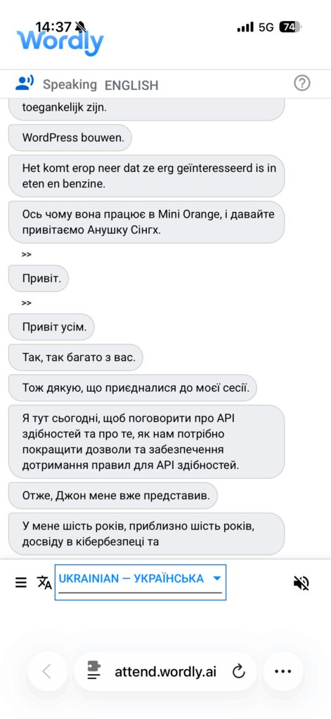
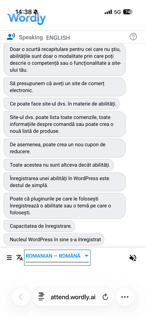
Another aspect of accessibility that was notable was language, translation and captioning. English was the primary language spoken by everyone who was giving a talk, but this was aided by live translated English subtitles shown on screen behind the speakers. Additionally the Wordly AI service was used to provide real-time translation in both audible and text formats. As an English language native I can’t attest exactly as to how effective this was as a tool, but I did try out the live text translation with Ukrainian1 and it seemed to be translating pretty well.
Talks and Panels
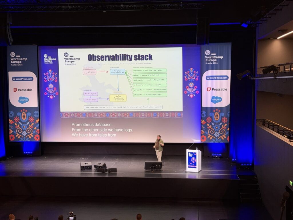
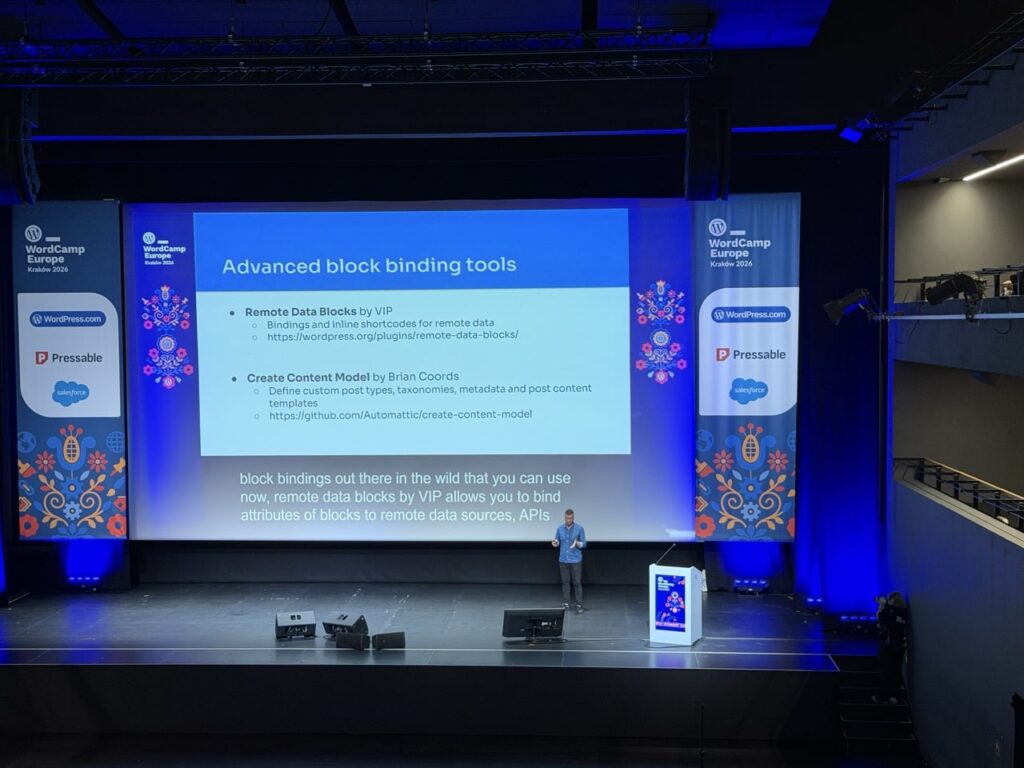
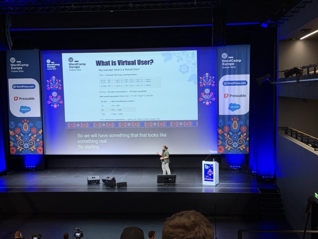
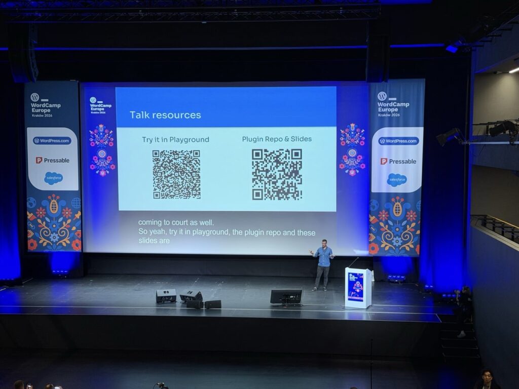
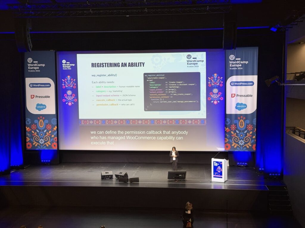
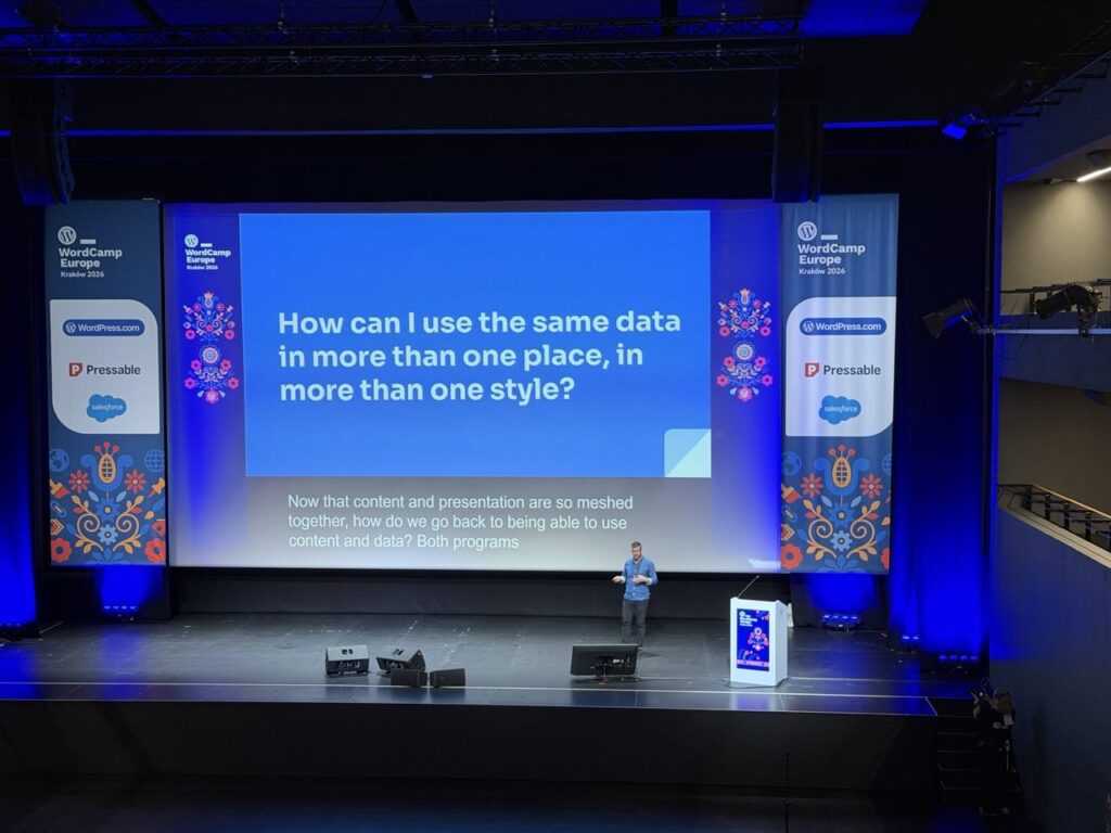
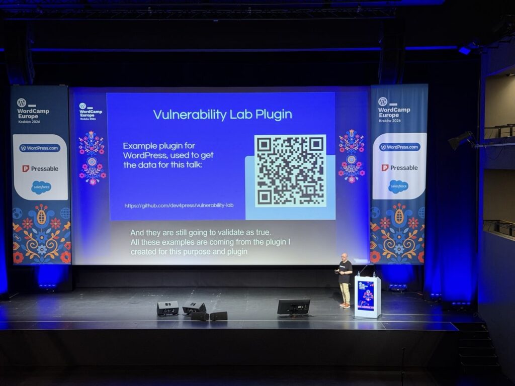
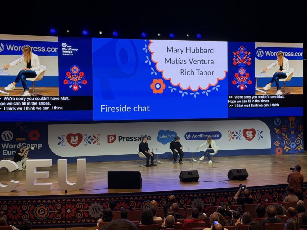
Talks and Panels with various speakers were a key component of the conference, there were two different tracks to pick from with a variety of subjects. Ranging from more technical talks about things like the new “Abilities API” or “Block bindings” to broader topics like the “Future of SEO”.
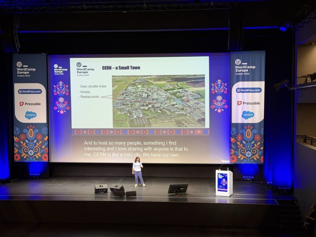
One of the talks that particularly stood out was “Two Worlds Collide: WordPress at CERN”, Joachim Valdemar Yde and Francisco Borges Aurindo Barros gave an overview of a huge project undertaken at CERN to consolidate 800+ websites on various disparate platforms onto WordPress:
Additionally, there were also two Workshop tracks with longer hands-on time exploring things like the “HTML API” and the “Interactivity API”. The workshops looked interesting but I was more interested in checking out the various talks rather than doing extended workshops, I think the workshops were fully booked as there was a lot of interest in them.
All the talks / panels and workshops were streamed / recorded so you can actually go and watch all of them, I will definitely be checking out all of the talks that I missed. Click through to the talks / workshop pages from the main conference schedule page to see the videos.
Conversations
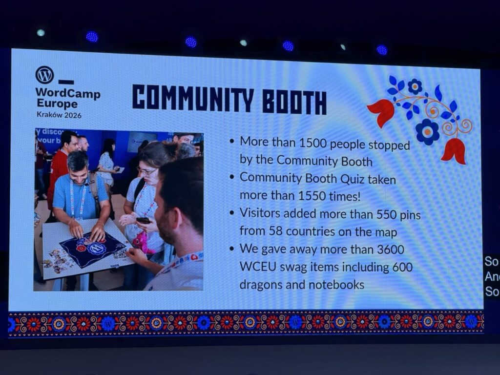
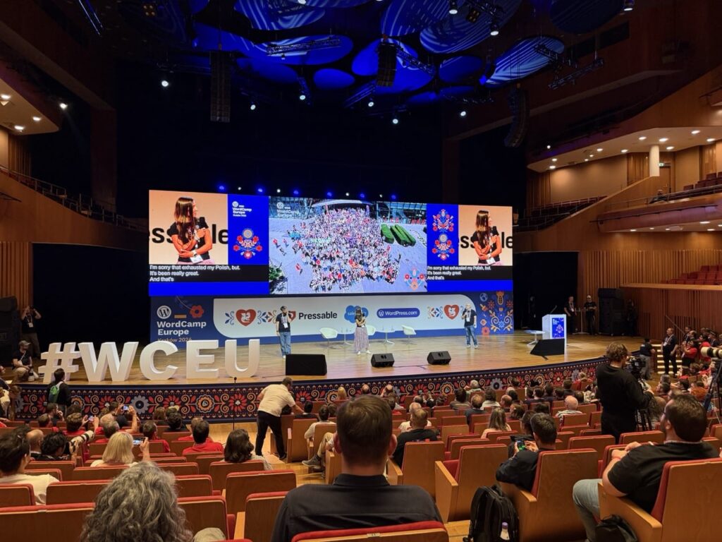
The talks were really interesting, but a big part of WordCamp is the conversations that take place outside of them. Whether it was sitting during a break, queuing to get some coffee or visiting the many exhibitor / sponsor booths in the venue, the conversations with other attendees were really interesting.
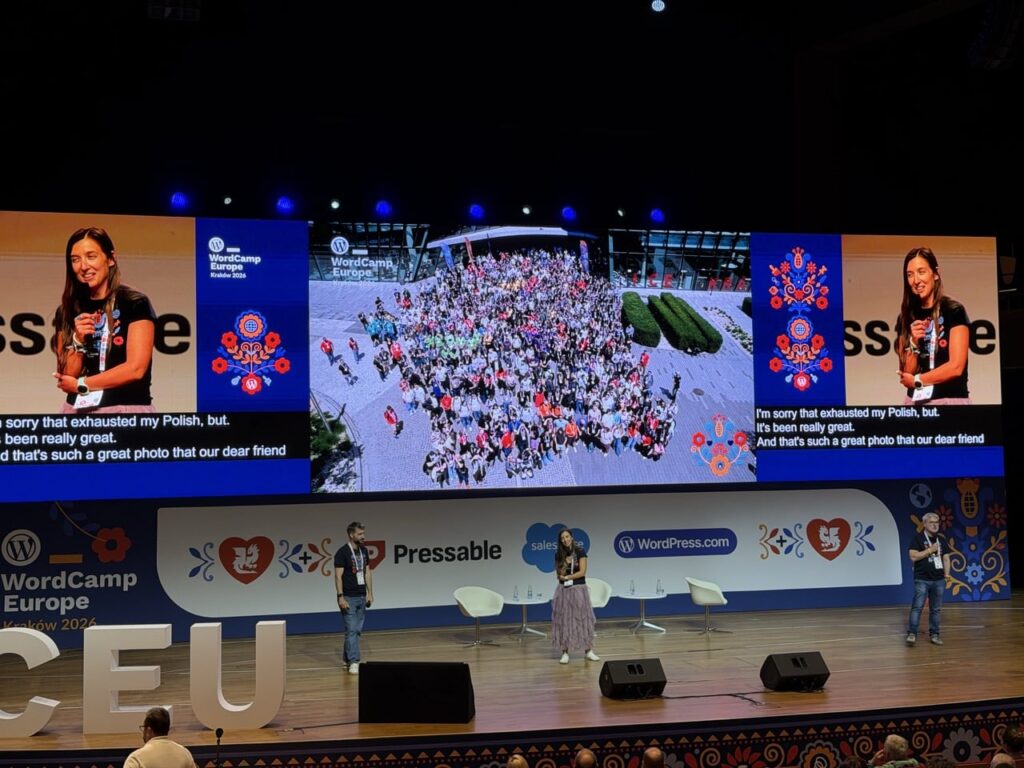
There was an incredible variety of backgrounds to the people attending the conference, it’s not just web design / developers attending but a huge array of people that use WordPress for their businesses, charities, personal projects etc. The power and success of WordPress is down to the community of people who care about WordPress, helping people to install, use, develop, translate, support WordPress and the people who use it.
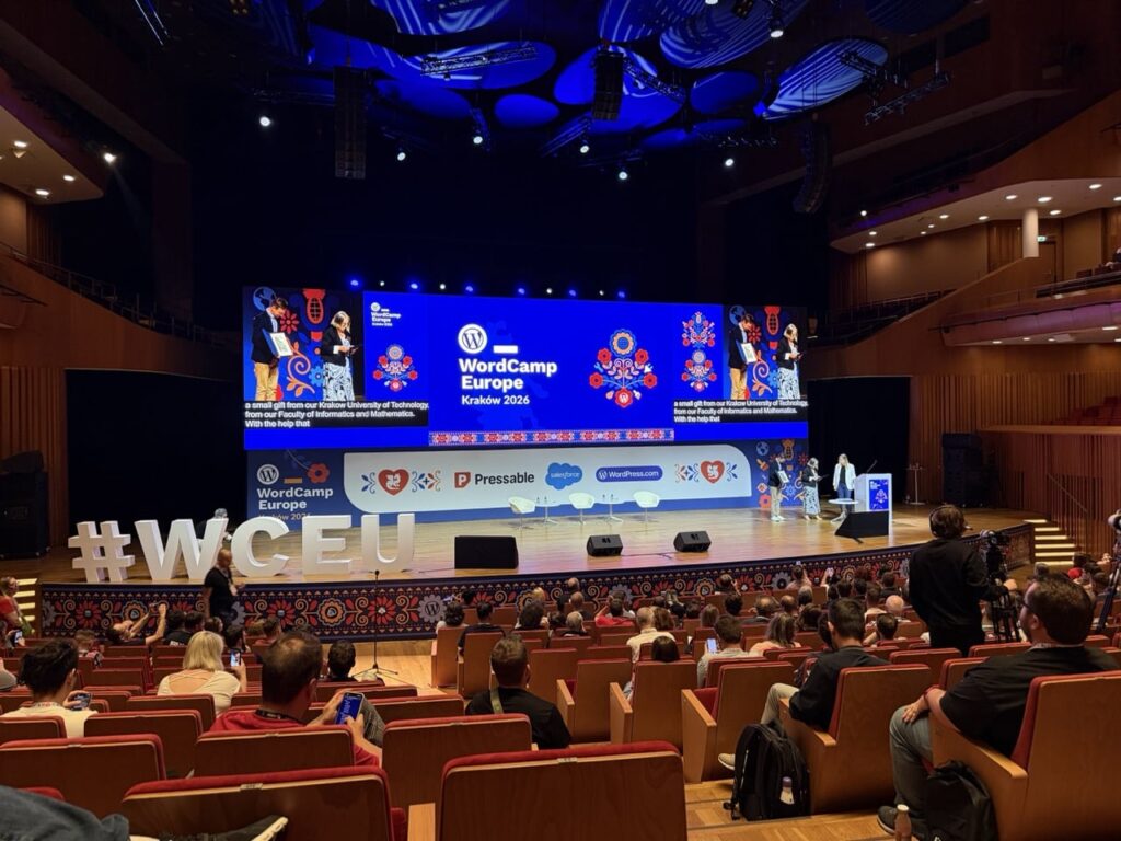
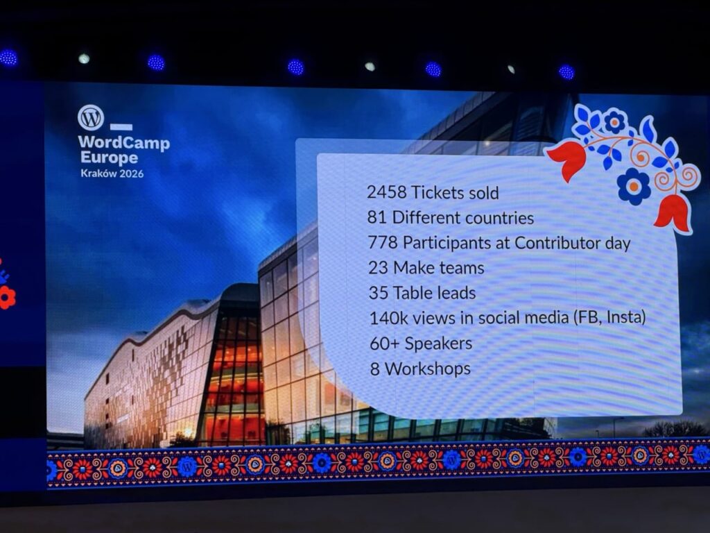
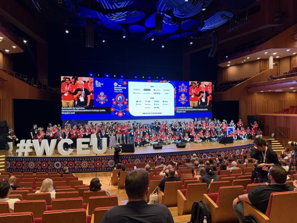
I think there were almost 2500 people attending from about 81 different countries, so it was a really broad and varied group of people in attendance. One thing I missed out on this time but would be keen to attend in future is the Contributor day, this took place the day before the conference and was an opportunity for people to meet together, find out more about opportunities to contribute to WordPress and use their skills to make it even better.
The after-party on the Saturday night at Forty Kleparz – aka Kraków Fortress2 – continued the incredibly high standard of the rest of the event, and a chance for the attendees, speakers and at least some of the organisers to relax after a job well done. A time for more conversation, great food, music, karaoke etc. I didn’t stay too long at this as it was an early start to catch a flight back to Scotland the next morning, but everyone seemed to be enjoying themselves.
WordPress and AI
Not unexpectedly, AI was a very common topic of both the talks and panels and conversations. The majority of exhibitors at the conference seemed to be advertising some form of AI or agentic integration, and whilst not every talk or panel had AI in the title, most of them mentioned AI one way or another. Co-incidentally WordPress 7.0 has recently launched which adds some key features enabling AI connections to allow deeper access to AI tools like Codex, Claude, Gemini etc.
There definitely was a lot of discussion about where WordPress stands in this highly dynamic and, yes, disruptive3 era that we are in. Overall it was positive with people excited about the opportunities that AI has for WordPress and how WordPress 7.0’s new AI connectors set a good foundation. I did have at least one conversation where someone expressed concern about how AI is affecting WordPress usage and whether this is contributing to a decline in its growth.
Overall there was a lot of energy being directed in how best to integrate AI into WordPress and related workflows. Definitely some food for thought in regard to my own usage of WordPress and AI. As someone who has increasingly used tools like ChatGPT and Codex in my own work, it was interesting to see how quickly AI has become part of the wider WordPress conversation.
A high bar
So some final thoughts, I heard some amazing talks from great speakers, had some excellent conversations with people, learned about some interesting services, companies, new features and initiatives relating to WordPress.
It really was an incredibly well run event, as a first time attendee I was blown away by the standard of the event and how well it was organised and the level of care and attention given. An incredible venue, in an incredible city, organised by an incredible team. Well done to all the organisers, volunteers and sponsors who made it happen!
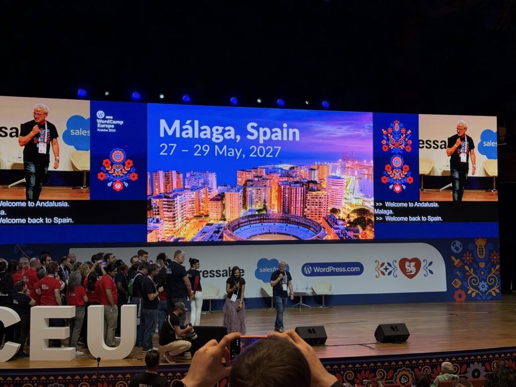
After more than fifteen years of using WordPress, attending my first WordCamp Europe was long overdue. I’m glad I finally made the trip and I’ll definitely be looking at attending future WordCamps when I can. Next year’s WordCamp Europe city has been announced, so if this event sounds like something you’d be interested in I’d strongly recommend booking a ticket for WordCamp Europe 2027 in Malaga, Spain as soon as they are available.
Quick video of my trip
It’s always fun to document trips, and Kraków was a beautiful city so there was a lot to try and capture. Here’s a wee video with some of what I saw over the two days or so:
- I have been slowly learning Ukrainian for a couple of years, I’m definitely far from fluent! My wife on the other hand (she is definitely a language geek!) is pretty fluent and is now learning Romanian. ↩︎
- Forty Kleparz is in the “Kraków Fortress”, a 19th century Austro-Hungarian fortification. Wawel Castle was also an amazing looking, centuries old building, but one I saw only from the outside, I definitely need a return trip to check this out more. ↩︎
- “Disruptive” is a word thrown out about various kinds of technology, but I think it is definitely appropriate to use it to describe the impact of AI in our lives. ↩︎