It doesn’t take a genius to note that mobile devices are pretty much overtaking the web, and that a huge amount of people – the majority depending on the statistics you pay attention to – are accessing the web via a mobile device such as an iPhone, iPad or other smartphone / tablet.
As such there has been a huge buzz about responsive design and how to make sites adapt well between a range of screen sizes and resolutions, and moving away from the concept of a fixed size of screen such as the ubiquitous 960 pixel grid framework. One of the biggest challenges in this new era of web design and development has been the lack of good tools to aid you in the process of creating responsive, adaptive websites.
Media Queries and Responsive Design
![]() The ability to work in code and create media queries to handle various device widths and related styles has been possible for a while, but it can be a bit mind-melting trying to keep track of all of this and to test as you work through the development process. Fortunately we are now beginning to see a range of tools to help you develop responsive sites, one of the most recent being Adobe’s new Edge Reflow tool which is an app that lets you visually adjust the viewport and tweak the CSS of various media queries. It’s a simple, focused app that lets you resize the viewport and tweak the styles as you go. At the time of writing it hasn’t been released yet but when I get a chance I will definitely be checking it out and writing something about it.
The ability to work in code and create media queries to handle various device widths and related styles has been possible for a while, but it can be a bit mind-melting trying to keep track of all of this and to test as you work through the development process. Fortunately we are now beginning to see a range of tools to help you develop responsive sites, one of the most recent being Adobe’s new Edge Reflow tool which is an app that lets you visually adjust the viewport and tweak the CSS of various media queries. It’s a simple, focused app that lets you resize the viewport and tweak the styles as you go. At the time of writing it hasn’t been released yet but when I get a chance I will definitely be checking it out and writing something about it.
Remotely Debugging Code on Mobile Devices
Another challenge with working with mobile devices is that you really need to test on actual mobile devices to get an understanding of the true behaviour of them. Although you can set the width of your desktop browser to be the same as that of an iPhone it won’t necessarily behave exactly the same way due to the differences in the way the browsers handle CSS or JavaScript.
One of the difficulties in testing on devices themselves is that it’s not very easy to debug when things don’t work as expected. On a desktop browser such as Safari you can use the Web Inspector to see the live code as you interact with it and also see any JavaScript errors that are triggered, but on a mobile browser there is often little available to help you detect the errors.
![]() Thankfully there are now tools being developed to allow remote access to the code running on the device itself, Adobe developed a tool codenamed ‘Shadow’ (now formally released as Edge Inspect) which works by providing apps for various mobile devices such as iPhone, iPad, Android phones and tablets.
Thankfully there are now tools being developed to allow remote access to the code running on the device itself, Adobe developed a tool codenamed ‘Shadow’ (now formally released as Edge Inspect) which works by providing apps for various mobile devices such as iPhone, iPad, Android phones and tablets.
With these apps installed on your devices you then run a desktop app on your computer as well as an extension in Google Chrome. You can then view websites in Chrome and they will be simultaneously displayed on the mobile devices running the apps, but the key feature is that you can remotely inspect the HTML, CSS and JavaScript running in the app on those devices. A really excellent tool.
Remotely Debugging in Safari
Adobe Edge Inspect (formerly Shadow) is a great tool, but what if, like me, you prefer to work in desktop Safari as your main browser and don’t want to or can’t use Chrome to test sites? In case anyone thinks this is just down to a matter of personal preference of browser I can give a legitimate example of why having to use Chrome can be a problem – Chrome’s in-built support for Flash gets in the way of testing content that is intended as fallback or alternative content on the desktop.
 Fortunately the recent release of iOS6 offers a new feature that enables remote web inspection of mobile Safari on iPhone or iPad.
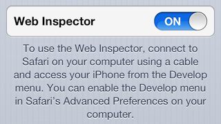
To make use of it you need to go into the ‘Settings’ app on your iOS device, and drill down into ‘Safari->Advanced’ where you’ll find a new toggle button for ‘Web inspector’, (this replaces the old ‘Debug’ option in mobile Safari which really offered little functionality).
Switch this on and you’ll see a small paragraph of text appearing which explains that you need to connect your device to your computer with a cable for this feature to work.
Once you’ve enabled Web Inspector on your iOS device(s) then you should find them listed in the Develop menu in Safari on your computer, it should looks something like this:

You can select the device and then it opens up a menu showing the available applications that web inspector can open. Note that you need to have mobile Safari open on your iOS device for any sites to be listed in the menu, if they’re not open then you’ll get a message saying ‘No Inspectable Applications’.
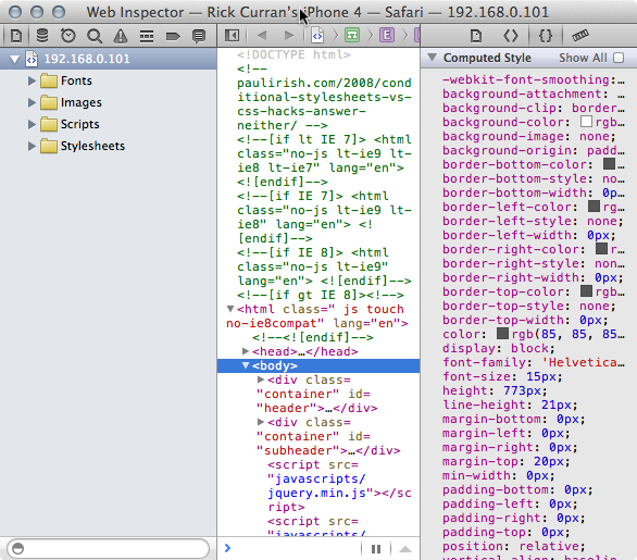
Once you select a site from the menu then the familiar Web Inspector window in Safari on your computer will open, the difference is that you are seeing the HTML, CSS and JavaScript from your iOS device. You can then browse around and interact with the site on your iOS device and inspect all of the changes occurring right in Web Inspector. Here’s a view of the HTML from a site on my iPhone:

Debugging via the console remotely
Just as with the ‘regular’ web inspector you can interact, view and update HTML and CSS and then see these temporary tweaks appear right on your iOS device. The main benefit in debugging for me has been in dealing with JavaScript / jQuery code, I can make use of console.log messages and debug via the console just as I would when working on my computer:

In a recent jQuery mobile based site I was developing I encountered code that was failing in mobile Safari but working fine in Safari on my Mac – exactly the kind of situation I mentioned earlier in this article where code is handled differently in mobile Safari. But thanks to this new remote web inspector functionality I was able to easily add some console messages and figure out what was going on and adjust the code to work around the problem.
A Great Solution for iOS Web Development and Testing
iOS6’s remote web inspection functionality is definitely a huge improvement if you are making sites that you need to test on iOS devices. With the increase in Android-based devices such as Google’s Nexus 7 and Amazon’s Kindle Fire tablets you will of course need to test on other devices besides iPhones and iPads. So tools like Adobe’s Edge Inspect are definitely something you will need to make use of too for testing across the various platforms and devices, but the simplicity of this iOS-specific testing workflow is very easy to set up and work with. A definite two-thumbs up from me!
I’m going to take a look at some of the other tools available to aid in the contemporary web development workflow of responsive, mobile-friendly design and write some more posts about them soon. In particular an updated look at Adobe’s Edge Animate tool and also a look at the Edge Reflow tool once it has been released.