With the reaction to the new Olympic logo still bubbling away I thought it would be interesting to see some of the past Olympic logos that have been used.
I came across a great site, sportslogos.net, they have logos going back to the 1896 Summer Olympics and the 1924 Winter Olympics. There’s a lot of great logos in there, interestingly there is the 1948 London Olympics logo, it’s a stark contrast to the newly announced logo:
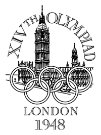
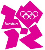
It’s hard to imagine two designs so different in approach really.
Recent Olympic Logos
I was keen to see the last few olympics logos from both the Summer and Winter Olympics, here’s a few of them.
Summer Olympics:
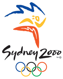
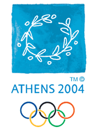
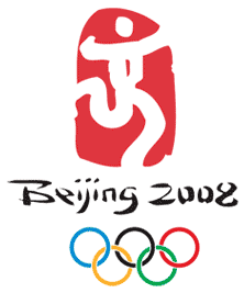 The two most recent Olympic logos and also the logo for the upcoming 2008 Beijing Olympics.
A key aspect of these logos is that they reflect the culture of these countries in a very clear way. Some may consider them to be clichés but I think they depict the countries quite well.
View past Summer Olympic logos…
Winter Olympics:
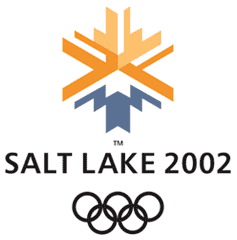
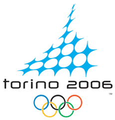
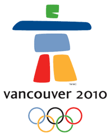 I think I like the Winter Olympic logos more than the Summer ones, I prefer the Winter Olympics to watch as well. These logos are very distinct and work well in various media just as the London 2012 logo is intended to do.
Interestingly the Vancouver 2010 logo is made up of 5 separate shapes just like the London 2012, but the difference in aesthetic is huge in my opinion. The shapes are much softer, the colours more appealing and the figure depicted by the shapes represents Canadian culture, the symbol means the word ‘friend’ in the native american Inuktitut dialect.
I really like the simplicity of the Vancouver 2010 logo, it also has a very simple message behind, that of being a friend to the world and welcoming the countries of the world to the Olympics I guess.
Many would perhaps say that these are too simplistic and that the London 2012 logo is pushing the boundaries of what has been done before, but from a simple aesthetic point of view they are just a lot friendlier than the London 2012 design.
View the past Winter Olympic logos…
Body swap
Given that the Vancouver 2010 and London 2012 logos both have 5 main sections I thought it would be interesting to see how they would look with their colour schemes swapped over.
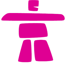
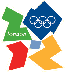
It’s interesting how much of an impact the shapes still have when these colour schemes are swapped over. I anticipated that the London 2012 logo would actually look a lot better in a more mellow colourway, but actually it still looks quite stark. The pink figure for the Vancouver 2010 Winter Olympics actually still looks quite soft and friendly despite being a pretty in-your-face shocking pink.
So, it will take both a colour scheme change and a smoother aesthetic for the London 2012 logo to seem friendlier and more appealing.
Maybe something like this?
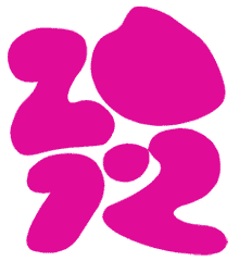 Heh heh, maybe not! I thought it would be funny to see what the London 2012 logo looks like if you apply some bezier curve tool action to it! We’d joked in the office today that maybe the copy of Illustrator used to draw out the logo had non-functioning bezier curve tools, hence the sharp angles of the logo ;)
Oh well, enough playing around with this logo, I can’t look at it much longer!
~Rick
@Alfie:
why is pi 3.14159265358979323846264338327950288419716939937510582097499459230781
i love tha new olimpic symbol but its boring and needs more coulour to advertise the bright streets of london!!
@John Hopkins: Yep, I think it is quite ugly, although I don't think it was intended to be 'beautiful' in the first place!
It doesn't look quite so bad when not used in dayglow colour schemes. Still, not my favourite logo that's for sure!
ugly London 2010. Agree?
Cool! I wonder what it would look like when the Beijing symbol if it is in some year in Beijing again.
What has this got to do with the price of pie?
weeeeeeeeeeeeeeeeeeeeeeeeeeee