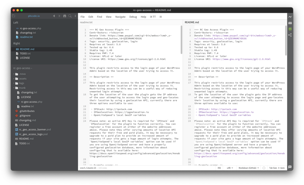
For the last few years I’ve used the Brackets text editor for most of my coding work, I’ve used a few different editors over the years but there are a few features that I specifically like about Brackets. At the top of that list of features is that all open documents are displayed in some kind of “Working files” section a vertical list in the side panel of the main window.
In 2021 Adobe who originally created Brackets as an open source project discontinued their support for it, so as it seemed like the writing was on the wall for Brackets I thought it was time to check out some other text editors to see if there was an alternative that I might switch to sometime in the future.
I tried a few different editors, Nova, BBEdit, Atom, Visual Studio Code, amongst others, and one of the things I noticed about most of them is that when documents were opened they appeared in horizontal tabs above the document window. Atom and Visual Studio Code seem to have plugins / extensions that can possibly modify that behaviour and BBEdit has a “Currently open documents” panel available by default which is the closest I found to what I wanted.
Thankfully the Brackets project had a lot of people who still wanted to use it so it has actually continued as an open source project now separate from Adobe, so my need to find a new editor can thankfully be put on hold for the time being (2024 edit – the Phoenix open source editor project looks to continue in the same vein as Brackets longer term). Out of curiosity today though I took a look at a few editors again just to see if vertical tabs / list for open documents has become more common yet, however things don’t seem to have changed much since I last looked.
It’s surprising as horizontal tabs just make so little sense to me in this context, I realise it’s a common web browser feature to have horizontal tabs but even that has begun to change with Microsoft Edge supporting vertical tabs and the latest Safari on Mac OS adding Tab groups as a vertical list at the side of the browser window.
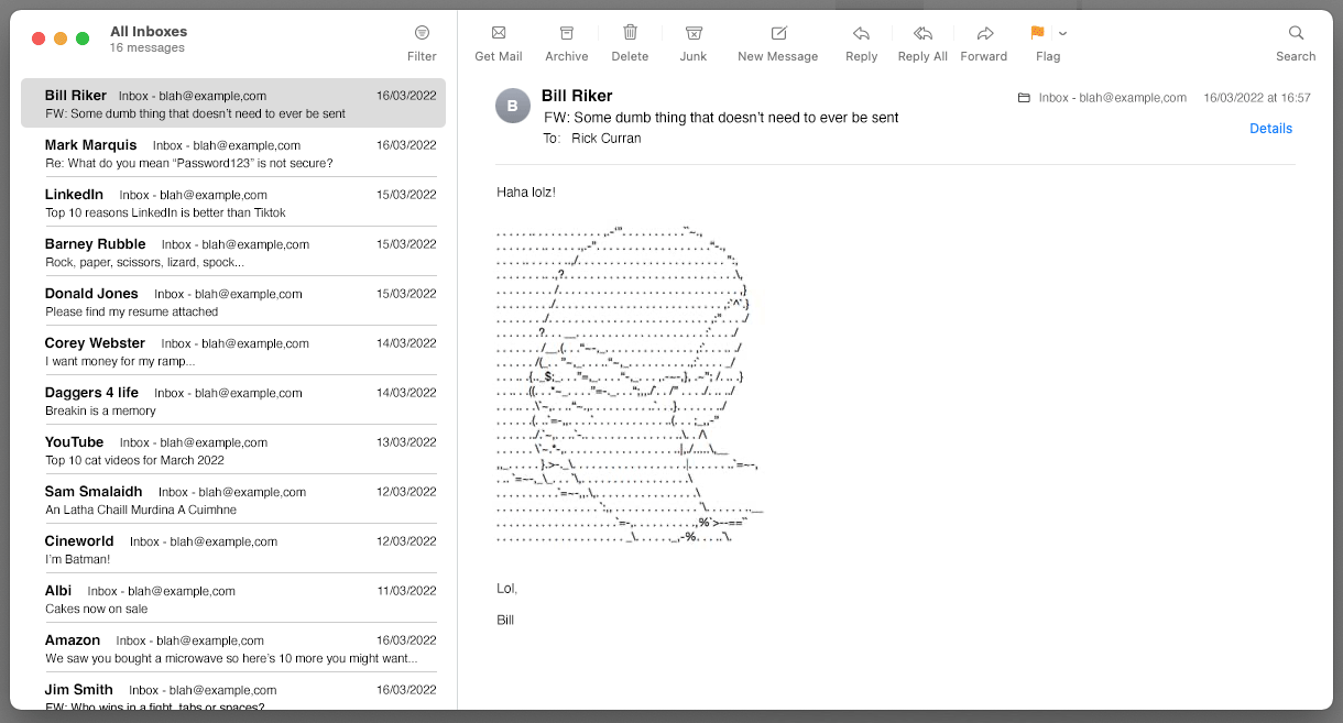
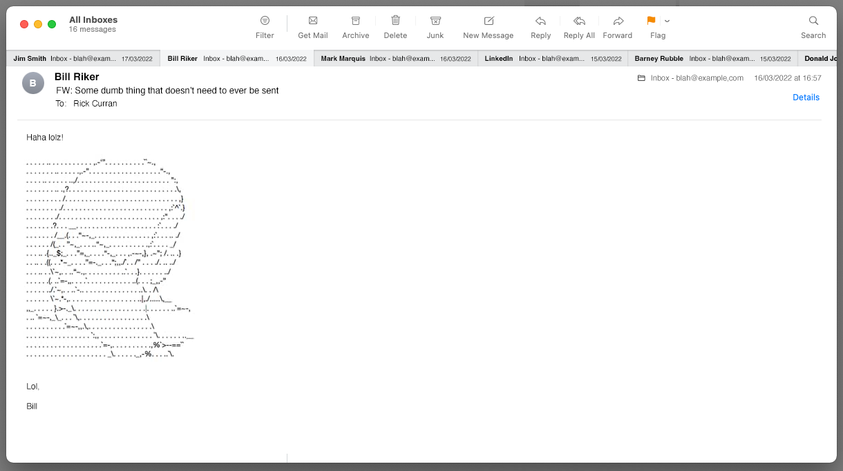
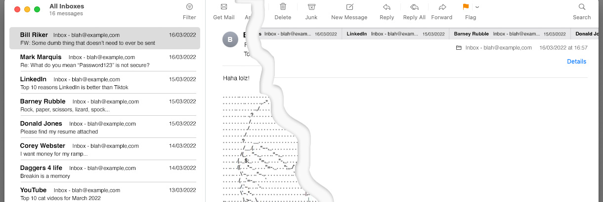
As an example of why horizontal tabs don’t work well I mocked up what another commonly used app would look like if it showed documents horizontally rather than a list: an Email app. Here’s a comparison to an email app with the standard vertical list of emails with what it would be like with horizontal tabs instead:


It would obviously be a bit of a nightmare to use an email application like that, but this is exactly what using a text editor without vertical tabs feels like to me when I try to use them!

