These impending regulations coupled with the fallout from the high profile Facebook / Cambridge Analytica data mis-use has brought the whole issue of data protection, privacy and handling of user data to the forefront of people’s minds. The consequences of mis-use of personal data provided to websites have been shown to be potentially far reaching.
Personal Data and Privacy
In the light of both GDPR and Facebook’s privacy issues the development community around WordPress has been quick to respond with enhancements to increase its compliance with the requirements of GDPR. WordPress 4.9.6 was released 17th May was a minor update in version numbering but added a few new settings and controls in the WordPress backend to help with compliance, the following is quick overview of what has been added and what the intentions are behind them.
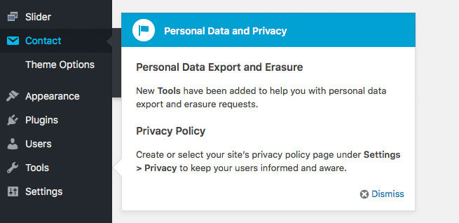
After updating to 4.9.6 you will see a popup highlighting the new “Personal Data Export and Erasure” features that have been added to the Tools menu, along with a new Privacy feature in the Settings menu.
Privacy Policy
Accessing the new Privacy feature in the Settings menu will show a general overview of why you may need to add a Privacy Policy page to your website. Whilst GDPR is currently the most prominent regulation which may affect the legal need for a privacy policy page there are also other regulations in place around the world.
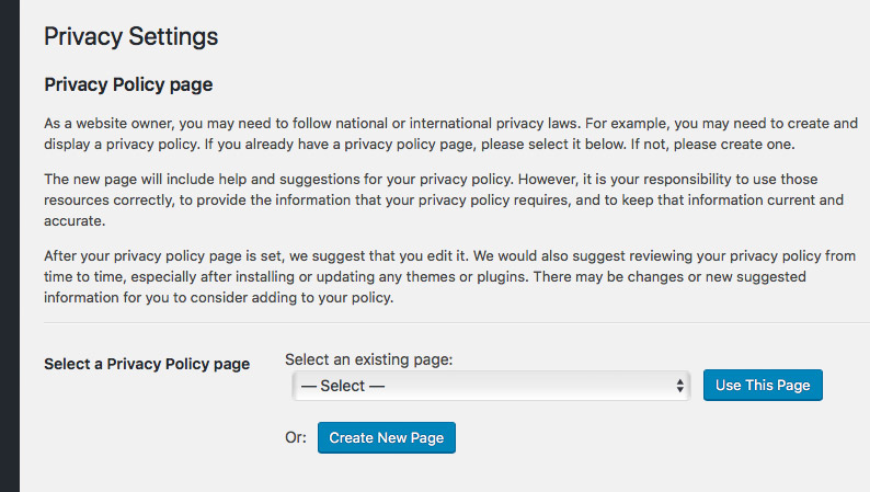
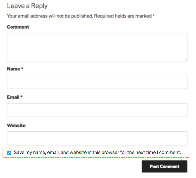
You can then select an existing Privacy Policy page if you have one or you can click the “Create New Page” option which will add a new page to your site with suggested privacy policy content, which you can then edit. Some of this content is more broad generic privacy information but some such as the “Comments” section details information that may be held when users comment on your WordPress site. So even if you do not have users logging in to your website it is important to note that the process of simply leaving a comment on your website involves the person doing so to provide some personal information in this process and the saving of cookies in the user’s browser. Subsequently there is a new permission checkbox on comment forms to allow users to explicitly consent to this.
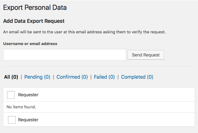
Export Personal Data
In the Tools menu there are two new features added to provide a way to manage the personal data of specific users’ data on your website. Regulations like GDPR require that users are able to request to see all of the data that your website may hold about that user, the new “Export Personal Data” function allows you to enter the email address of a user which will then email a link to a zip file of all of the data held relating to that email address.
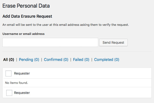
Erase Personal Data
The second new addition to the Tools menu is the “Erase Personal Data” function. This provides a way for any identifying information related to a user to be erased from the site. It’s worth noting that this doesn’t delete actual comments from the site but it does remove any way for these to be identified either on the front-end or back-end of the website.
You enter the email address of the user requesting erasure of their personal data into the field and then this will send out an email to the user asking them to confirm the erasure of their data, so it puts the ultimate control of this data in the user’s hands.
Are you a plugin developer?
If you are a WordPress plugin developer then hopefully you haven’t been oblivious to these changes that have been happening in WordPress core, but if not then it’s worth taking a look at the update guide for WordPress 4.9.6 as there is some impact on plugin developers. Particularly if your plugin handles any personal user data then this may be extremely important for you to get up to speed on: https://make.wordpress.org/core/2018/05/17/4-9-6-update-guide/
You should also have a good read through the Privacy section of the Plugin handbook: https://developer.wordpress.org/plugins/privacy/
What next?
These tools in WordPress core are just the start of an increased focus on user privacy and data security within WordPress and the many plugins in the WordPress ecosystem. You can expect some further additions in future releases and in particular new features added to third-party plugins in the interest of data protection and privacy.
 I have been working more and more with build tools in my web development process over the last year and I’ve found a Gulp based workflow with the recently launched Foundation 6 works great and I’ve been gradually getting my head around the whole process.
 Like many web design / developers I’ve made use of virtualisation applications like
 The ability to work in code and create media queries to handle various device widths and related styles has been possible for a while, but it can be a bit mind-melting trying to keep track of all of this and to test as you work through the development process. Fortunately we are now beginning to see a range of tools to help you develop responsive sites, one of the most recent being Adobe’s new
  Thankfully there are now tools being developed to allow remote access to the code running on the device itself, Adobe developed a tool codenamed ‘Shadow’ (now formally released as
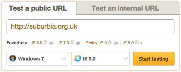
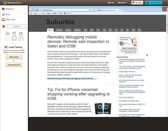
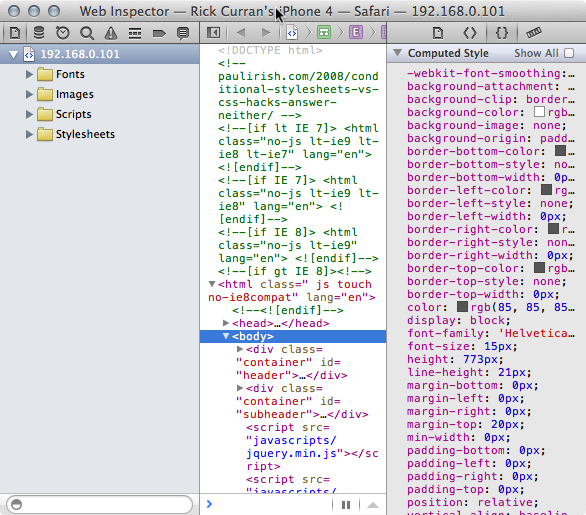
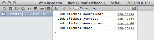
 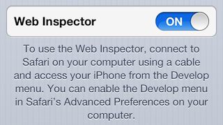 Fortunately the recent release of iOS6 offers a new feature that enables remote web inspection of mobile Safari on iPhone or iPad.
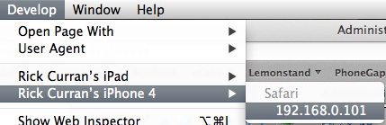
 Adobe have just announced the new version of their

 The good news for CSS3 and Font-face etc is that Dreamweaver can be extended very easily to add support for, even better news is that I have already written a couple of Extensions for Dreamweaver which can be downloaded for free from the Dreamweaver Exchange, you can also read a bit more about them on the
  I’ve written about BrowserLab before
 Ok, slightly odd to call this a review when I haven’t even read the book yet! However, eduStyle have published a book titled “The eduStyle Guide to Usable Higher-Ed Homepage Design”, given that the website is such a good resource then it’s certain that the book will be very useful too. It’s been released as a PDF version initially and will be published in print in due course for those, like myself, that like the feel of real paper! The book has some interesting goals: