…it’s a big-ass table.
The digital domain of Rick Curran
…it’s a big-ass table.
Back in April I wrote a post entitled "Four mysteries of the Universe…" where I pondered over a few unanswered questions:
Well, interestingly 3 out of those 4 questions have been answered! The only one outstanding is #1 – Adobe’s European pricing for the CS3 suite. I’ve yet to hear a better answer than exchange rate differences or pricing structures in global locales. On the plus side though Adobe’s profits are up 24%! ;)
#2 mystery was solved when Sony finally brought out a new version of their Sony Vegas video editing software to allow those who bought their HDR-SR1 six months to edit their HD video footage!
#3 mystery was partially solved last week when Apple updated their website and got rid of the aqua pin-stripe navigation graphics. Although I have to say partially solved as the UK site has yet to be updated. I don’t really understand why the UK lags behind on offerings by Apple, when new products are announced they never appear until a few hours later than the US site. Don’t get me started on the unavailability of TV shows and Movies in iTunes, or maybe the iPhone but I’m not so bothered about that as it’s only just coming out in the US, but TV shows and movies have been available in the US for about 2 years now!
#4 mystery was solved after I’d been pestering a few people at Adobe for an answer to whether there would be a new version of Director coming anytime soon. I got an email reply from someone who pointed me to the Director FAQ page which states, albeit slightly uncommittedly:
Adobe has not published an official time frame for the next release of Director and generally does not disclose details of new releases more than 30 days before a product is expected to ship. However, our current planning assumption is that the next major release of Director will be in the second half of 2007.
Unfortunately I was too late to get on the Beta testing programme for Director, I would have loved to have had an opportunity to help test the next version of Director.
I’m glad it’s an app that’s going to continue to be developed although I do feel there is a big challenge being presented by the whole AIR (formerly Apollo) project and advances in Flash like PaperVision3D.
I’m a bit concerned that the lack of real announcements about this has caused many to consider Director dead in the water, I look forward to there being a public beta on Adobe Labs!
Apple just announced updated information about the iPhone, namely that it will have longer than expected battery life and an ‘optical quality glass screen’ rather than plastic. The iPhone’s battery will provide:
Oh, and the Olympics 2012 logo still sucks! Also Hi to students from New College, Pontefract, thanks for your ‘insightful’ comments on my ‘Historical overview of Olympic logos’ article ;)
~Rick
Who cares about having a multi-touch interface, Safari web browser, enhanced voicemail features and widescreen iPod format when you can have Marioland and other NES ROMs running on your phone!
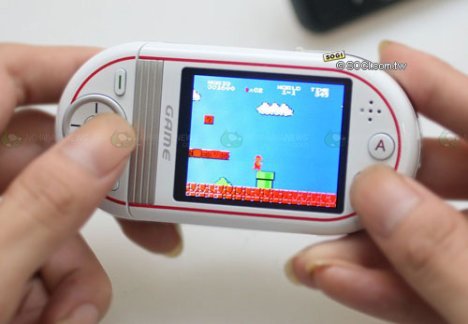
The phone is called the Gionee S20, the other cool thing about it is that it can hook up to your TV so you can play the games just like back in the day!
I have no idea if they’ll be available in the UK but I’m sure eBay will be a good source for them.
~Rick
If this turns out to be true then it means the FairPlay DRM scheme must now have the ability to do time-limited control of playback capabilities. This will definitely make a good addition for those with an AppleTV. If this story is true then the BBC iPlayer team should go talk to Apple right now!
Wow, I hadn’t thought about this, but seeing as Adobe’s Apollo (now known as AIR) initiative uses WebKit and runs cross-platform then it makes sense that a native Windows version of Safari would be possible. This will be very handy for web developers ‘stuck’ on Windows! It’s available now as a beta for OSX and Windows.
Great looking set of features in there, I’m really liking the changes to the look and feel of the user interface. The iTunes-esque Finder looks to be a good update, I’m wondering how well those who really hate the current finder will take to this, will it be an improvement or not? I’ve not seen any concrete evidence that the Finder has been substantially rewritten, will this be the end of spinning beachballs when network volumes disappear?
~Rick
Ok, forgive the dumb title of this post! It’s probably not hard to miss the fact that I’ve got ads on my blog but I hope that they are generally for things that are of interest to some of the people who visit my site and fairly relevant to the subjects I like to write about.
One of the links I’ve had for a while is to an online DVD rental site called LoveFilm, I’ve been a long time online DVD rental user until fairly recently having used WebFlix and then ScreenSelect which has now, after several mergers / buyouts turned into LoveFilm. I say until recently as I stopped my account a few months ago as I was watching far more films on demand via my Telewest cable TV package instead, I was also a bit frustrated about how long it was taking to receive DVDs sometimes.
Since I switched to Sky however, I’ve not been impressed by the movie options on there, no on demand service and too much per film (about £3.95 for recent films). I got to thinking about reactivating my account with LoveFilm – conveniently your account isn’t deleted on cancellation but it simply stays inactive keeping your list of movies and previous rentals. I finally decided to do it when I came across a handy activation code that will give you a 3 month free trial, even for people like me who are reactivating their accounts.
So, all this leads up to a link to LoveFilm where you can sign up for this free trial for yourself! I just thought it was too good an opportunity not to give it a little bit of exposure :)
Go check it out and sign up for yourself, don’t forget to use the activation code LFZZ98778 to get yourself the 3 month trial of the Combination 2 which means you can get unlimited movies a month, 2 discs at a time, normally £14.99 a month. Check that you are receiving the 90 day trial as sometimes it may only be a 14 or 28 day trial.
Click the image below to click through to LoveFilm.com and put the activation code in the ‘promotion or gift code’ field when signing up, then enjoy unlimited DVD rentals for 3 months!
~Rick
I just came across a link in my feeds giving a heads up about a new OSX beta download from Nokia, it’s for an application called Nokia Media Transfer. At first I thought it would just be some badly ported software for Mac, but it’s actually pretty good. It manages the setup and control of audio & video media files from your phone.
The cool part is that it sets up your phone’s camera to be a source camera for iPhoto, Image capture etc. So no need to manually transfer and import the files, it will just sync up over bluetooth when you start iPhoto. It will also do the same with iTunes, syncing playlists etc.
I don’t use my phone for music but I do take a fair amount of photos with it so the iPhoto integration is pretty cool. There is also an application called Nokia Device Browser which can be used to browse the files and folders on your phone, it works much better than the default OSX bluetooth file browser, there’s a screen shot of device browser in action below.
Here’s a few screenshots of some of the screens involved:
![]()
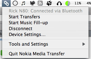
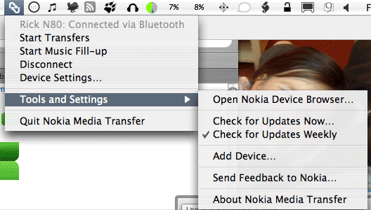
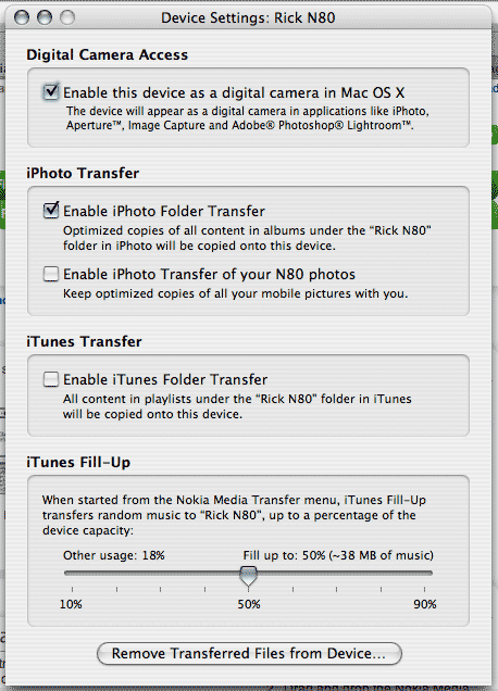
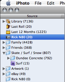
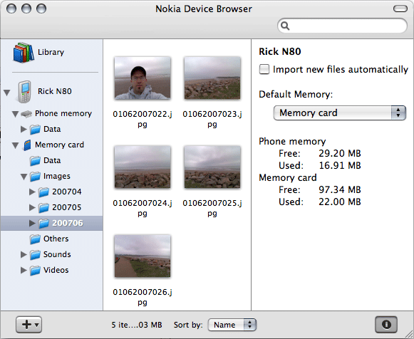
All in all Nokia Media Transfer looks pretty good, it definitely isn’t just a piece of badly ported software. If Nokia can manage to make the software experience better then they will be going a long way to getting out of the trap that many hardware device manufacturers find themselves in, that of having great hardware but absolutely terrible software. Sony, I’m looking in your direction!
To use Nokia Media Transfer you will need Mac OS X 10.4.9 or higher, iTunes 7 or higher, and iPhoto 6 or higher.
~Rick
With the reaction to the new Olympic logo still bubbling away I thought it would be interesting to see some of the past Olympic logos that have been used.
I came across a great site, sportslogos.net, they have logos going back to the 1896 Summer Olympics and the 1924 Winter Olympics. There’s a lot of great logos in there, interestingly there is the 1948 London Olympics logo, it’s a stark contrast to the newly announced logo:
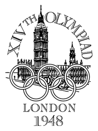

It’s hard to imagine two designs so different in approach really.
I was keen to see the last few olympics logos from both the Summer and Winter Olympics, here’s a few of them.
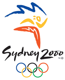
 The two most recent Olympic logos and also the logo for the upcoming 2008 Beijing Olympics.
A key aspect of these logos is that they reflect the culture of these countries in a very clear way. Some may consider them to be clichés but I think they depict the countries quite well.
View past Summer Olympic logos…
 I think I like the Winter Olympic logos more than the Summer ones, I prefer the Winter Olympics to watch as well. These logos are very distinct and work well in various media just as the London 2012 logo is intended to do.
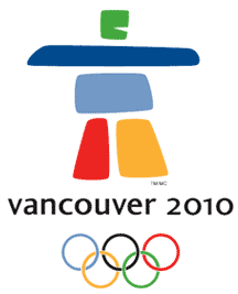
Interestingly the Vancouver 2010 logo is made up of 5 separate shapes just like the London 2012, but the difference in aesthetic is huge in my opinion. The shapes are much softer, the colours more appealing and the figure depicted by the shapes represents Canadian culture, the symbol means the word ‘friend’ in the native american Inuktitut dialect.
I really like the simplicity of the Vancouver 2010 logo, it also has a very simple message behind, that of being a friend to the world and welcoming the countries of the world to the Olympics I guess.
Many would perhaps say that these are too simplistic and that the London 2012 logo is pushing the boundaries of what has been done before, but from a simple aesthetic point of view they are just a lot friendlier than the London 2012 design.
View the past Winter Olympic logos…
Given that the Vancouver 2010 and London 2012 logos both have 5 main sections I thought it would be interesting to see how they would look with their colour schemes swapped over.

It’s interesting how much of an impact the shapes still have when these colour schemes are swapped over. I anticipated that the London 2012 logo would actually look a lot better in a more mellow colourway, but actually it still looks quite stark. The pink figure for the Vancouver 2010 Winter Olympics actually still looks quite soft and friendly despite being a pretty in-your-face shocking pink.
So, it will take both a colour scheme change and a smoother aesthetic for the London 2012 logo to seem friendlier and more appealing.
Maybe something like this?
 Heh heh, maybe not! I thought it would be funny to see what the London 2012 logo looks like if you apply some bezier curve tool action to it! We’d joked in the office today that maybe the copy of Illustrator used to draw out the logo had non-functioning bezier curve tools, hence the sharp angles of the logo ;)
Oh well, enough playing around with this logo, I can’t look at it much longer!
~Rick
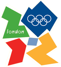
 Well, the new logo for the London 2012 Olympics has been announced and the reaction has been split between those who love it for it’s unusual, unconventional approach and those who hate for just looking pig ugly.
I have to say that I’m really in that latter camp, although I can relate to some of the ideas behind it I just find the 80’s aesthetic of the logo and the accompanying motion graphics unappealing. I remember the 80’s and it wasn’t pretty. No, really, it wasn’t!
You can find out more about it over on the London 2012 Olympic website, http://www.london2012.com.
There has definitely been mixed reactions to the logo and the accompanying graphics, however one reaction that wasn’t expected or intended was that it caused epilectic seisures! Some in people who hadn’t had a seisure in years, the BBC website ran an article, "Epilepsy fears over 2012 footage":
Epilepsy Action said the images could affect the 23,000 people in the UK who have photosensitive epilepsy.
It said it had even triggered breakthrough seizures where people have a relapse after being seizure-free for a long time.
A spokesman for the charity said: "The brand incorporates both the Olympic and Paralympic Games, which is ironic as the latter is a showcase for athletes with disabilities.
There’s also a petition campaigning for the logo to be redone, currently there are over 31,330 signatures.
Some people have complained about the £400,000 spent so far on the logo but on the one hand I don’t think this is that great a cost when you consider the various processes and work involved. However, that doesn’t change the fact that I don’t like it!
Such a high profile logo as this, that represents the whole of the UK (not just London!), should be of far better quality. I think it deserves something that is more aesthetically appealing and looks a bit more sophisticated rather than something that’s only strength is that it has sophisticated thought behind it.
I’ll see what I think of it over time, or maybe they’ll change it…
~Rick
Well, not blogged much for a bit, been very busy at work the last couple of weeks getting a couple of websites finished off.
The first of which was for the School of Media Arts & Imaging at Duncan of Jordanstone College of Art & Design. We’re pretty happy at work with way it’s turned out really, it’s really two sites in one with the addition of an all-new Research portal focusing on all the interesting work going on in the School.
Interestingly it’s now 10 years since I graduated from this very school (known then and until just recently as the School of Television and Imaging though) with my degree in Time Based Art, time flies!
I haven’t mentioned Sky / Virgin Media for a while, I’ve now switched from Virgin over to Sky. So I now have access to Sky One and therefore ‘Lost’ again! What’s more it’s cheaper than I was paying for my Virgin Media package. The Sky broadband is pretty good although I do have criticisms of the setup a little bit, however it does seem to run pretty fast. Virgin for sure will have faster speeds in future but for now 8Mb is pretty awesome.
My main criticism of the broadband is that it comes as a supposedly non-user editable setup. The free router is basically a Netgear router with a slightly amended firmware which comes packaged specifically for Sky. What you can’t do is login to the web-based Admin system and configure it, it comes with the SSID and password preset as well as the connection details. However, I wanted to get into it so a quick google search came up with the goods. You can use a username of ‘admin’ and password ‘sky’. Hardly tight security! Anyway, I’ve now logged in and changed the security from wpa to wep and changed the password too.
It did make for an easy setup but I still think they should provide this information to allow some customers to get into the box and make changes as it is a pretty basic security setup by default. Also some may want to make use of the content filtering / scheduling to control access to the internet etc.
 Devo
DevoI’ve been a big fan of the band Devo for years and they are playing a gig at Glasgow Academy on Sunday June 24th.
I’m hoping to go and check them out, it’s probably one of the few opportunities I’ll get to see them play.
Nope, not the band! I mean my wife Annie is pregnant! Yep, I’m going to be a Dad again! The first scan is due very soon so I’ll post a picture of course for any family members or other interested parties!
That’s all for now!
~Rick