Adobe BrowserLab – Hosted Browser testing from Adobe
BrowserLab provides web designers exact renderings of their web pages in multiple browsers and operating systems, on demand. BrowserLab is a powerful solution for cross-browser compatibility testing, featuring multiple viewing and comparison tools, as well as customizable preferences. Since BrowserLab is an online service, it can be accessed from virtually any computer connected to the web. Also, Adobe Dreamweaver® CS4 software users have access to additional functionality such as testing local and active content.
This service / app has been in development for some time, Adobe actually showed a sneak peak of it back in November at their Max Conference under the code name ‘Meer Meer‘. So although this might seem like Adobe playing catchup with Microsoft’s recent ‘SuperPreview‘ release it’s actually nothing of the sort. If you compare BrowserLab with SuperPreview you’ll see that they’re quite different apps – primarily that SuperPreview is a Windows app that only let’s you preview IE6 and either IE7 or 8 depending on which is installed – and of course requires you to be running on Windows to use it whereas BrowserLab is a browser based application that simply requires the Flash plugin and therefore works on both Windows, Mac and Linux.
Browser and OS versions currently supported in BrowserLab at this time are:
- Firefox 2.X and 3.X (Windows XP and Mac OS X)
- Internet Explorer 6.X and 7.X (Windows XP)
- Safari 3.X (Mac OS X)
So a good range of browsers are covered, although IE8 really needs to be there along with Opera as well to really cover all the main desktop browsers. Although there isn’t yet as big a range of browsers to test in compared to other services like Litmus, BrowserLab has a benefit in that it provides some additional tools to help you compare the preview of your site in the different browsers.
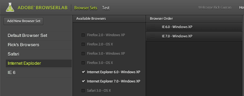
Browser Sets in BrowserLab – Only preview preferred browsers.
Browser Sets in BrowserLab basically let you create groups of browsers that you want to have rendered when testing. This can save time over just having every browser preview rendered for your site, if you only want to see IE6 and IE7 then you can create a BrowserSet with only those contained in it.
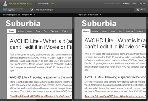
 2-up View in BrowserLab
You can view a 2-up layout that lets you compare the differences between rendered previews. This creates a side-by-side view displaying two different browsers which you can quickly switch between to compare different browsers.
You can also zoom up to 200% to compare the previews more closely and also zoom out to 75% to get a more overall comparison.
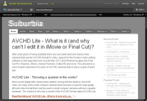
Onion Skin view in BrowserLab
The Onion Skin view lets you compare two different previews but overlays them on top of one another. You can then use a slider to fade between the two selected browser previews, if you’re trying to work on something quite pixel accurate then this can be quite useful – although it has to be said that exact pixel placement accuracy of page layouts isn’t necessarily something to worry about. It’s still a pretty useful feature though.
Preview directly from Dreamweaver CS4 in BrowserLab
One other feature benefit that BrowserLab has over other services such as Litmus is that there is a Dreamweaver CS4 extension that allows you to test your site layouts directly from within Dreamweaver. The added benefit here is that this avoids the step of having to make your entire page live on the web before testing as it works with just the local files on your system.
As a beta release BrowserLab looks pretty good, although it does have some hot competition from services like Litmus and Browsershots – especially in regards to Litmus’ push towards supporting mobile Safari on iPhone / iPod touch.
To checkout BrowserLab for yourself, read more about it over at the BrowserLab pages at Adobe Labs website.
Mac OS 10.5 Leopard – Part 1: Safari form field warnings
This is the first of a few posts about things I’ve noticed since I started using the new version of Mac OS 10.5. There’s a lot of changes in the OS, as you’d expect given that it is a major new release and 2½ years in the making, I’ve been picking up on some of the visual changes / user interface changes since the previous version.
Safari’s form field warnings
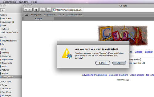
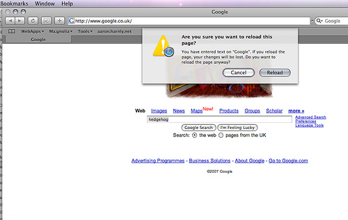
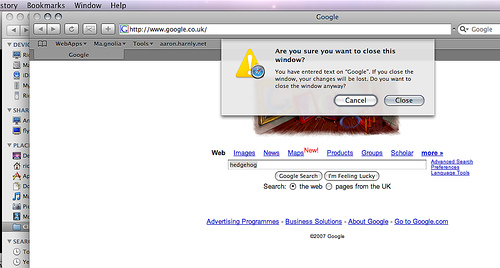
The new version of the Safari web browser in 10.5 boasts quite a lot of changes, one that I noticed was that it gives warnings if you try to close, reload or quit when you have started entering text into any text fields on the page. These are very simple changes but they are very useful.
Quitting Safari warning:
Reload page warning:
Close browser window warning:
Apple publishes ‘Optimizing Web Applications and Content for iPhone’
Apple published Guidelines for developing web content for the iPhone over at http://developer.apple.com/iphone/. It’s good to see a focus on standards based development being encouraged there, it makes sense given that the Safari browser on the iPhone has great support for XHTML and CSS, particularly CSS 3 properties – of which the iPhone makes particular use of, more of that in a moment.
Quick overview of the Guidelines…
The guidelines are split into several sections:
- Understand User-iPhone Interaction
- Use Standards and Tried-and-True Design Practices
- Integrate with Phone, Mail, and Maps
- Optimize for Page Readability
- Ensure a Great Audio and Video Experience
- Know What Safari Supports on iPhone
- Connect With Web Developers
Understand User-iPhone Interaction
This section introduces you to the whole concept of interacting with the iPhone, mainly that the input device is not a mouse but your hand so it’s not as precise as a mouse so web interfaces for the iPhone need larger click targets to interact with. As has been pointed out on various blogs there is no copy and paste, but there is also no drag and drop or text selection either so this is another factor to keep in mind.
Safari on iPhone doesn’t have windows that can be moved around or have scroll bars like a conventional browser, content is resized intelligently to fit the viewing area, it is recommended to avoid wide blocks of text. Double-tapping is used to zoom in to content.
Use Standards and Tried-and-True Design Practices
This section really reinforces the use of web standards for designing pages for the iPhone. Makes the point that Safari on iPhone uses a ‘real’ browser in that it doesn’t use stylesheets targeted towards handheld devices, it’s intended to give a rich browsing experience by supporting HTML 4.01, XHTML 1.0, CSS 2.1, partial CSS 3.xx, JavaScript 1.4, DOM support, AJAX, XMLHTTPRequest.
It encourages the use of separate HTML, CSS and Javascript as well as using valid HTML, and also optimised images and script content to keep sites running smoothly.
Integrate with Phone, Mail, and Maps
This section starts to get to more of the iPhone specific code examples that hook into the dedicated apps on the iPhone. You can click on Telephone numbers in Safari and the number will be automatically dialled, Safari will automatically convert numbers that look like phone numbers into telephone links. However you can format a telephone link on purpose:
<a href="tel:1-408-555-5555">1-408-555-5555</a>
Email links are in the standard format and open up Mail in order to send an email., links to Google maps take the standard link format also but these are opened up into the dedicated Google Maps application on the phone. I believe that links to YouTube movies do something similar but there is no mention of this in this section.
Optimize for Page Readability
This section gets more interesting and links back to my initial mention of CSS 3 properties. If you want to provide a particular window size for a page to be viewed on the iPhone you can set an iPhone specific stylesheet by using a CSS 3 media query like so:
<link media="only screen and (max-device-width: 480px)"
href="iPhone.css" type="text/css" rel="stylesheet" />
There are more guidelines for laying content out for the iPhone viewport such as a recommended width of 320px so that the layout doesn’t change between portrait and landscape modes. It also details some webkit specific CSS properties to help control text sizing. Image formats supported are JPG, PNG, GIF and TIFF.
Ensure a Great Audio and Video Experience
Formats and bitrate advice is provided here to help optimise video for WIFI and EDGE network capacities. Maximum video dimensions of 480 x 360px are recommended. Formats supported are H.264, MPEG-4, AAC-LC, .mov, .mp4, .m4v, .3gp file format, video or audio that can play on an iPod.
There is advice for the server side of providing audio and video for use on the iPhone too, interestingly the RTSP protocol is not supported but apparently only video via HTTP streaming.
Know What Safari Supports on iPhone
This set of guidelines covers the resource capacity of Safari on the iPhone. Downloaded resources such as CSS, HTML, Javascript, images or other non-streamed media must be less than 10Mb. Javascript execution is limited to 5 seconds before it times out, this will really mean people having to review their use of the various javascript libraries available and make sure that only the bare essentials are present. Interesting to see how Adobe’s Spry library stands up on the iPhone.
Other information covers support for files including the various mime types, PDF is supported but not (as has been widely covered on various blogs!) Flash or Java. I think various browser testing scripts for detecting Flash will need to be updated to factor in the iPhone’s lack of flash support. I wonder how long it will be before we see Flash on the iPhone? It surely must be coming, seems like a missing piece of a puzzle to me? It also covers the Security support of Safari such as SSL and RSA.
Connect With Web Developers
It ends with some useful web development links including W3C, WHAT-WG and Web Kit project site.
There’s a real push throughout about the fact that web standards and associated best practices are an integral part of creating successful sites that work well on the iPhone safari browser.
When I’ve got a moment I’ll try out a the iPhone specific code, especially now that my friend Alyn seems to have successfully gotten his iPhone activated, more about that on his blog I’m sure.
~Rick
Thoughts on WWDC07 keynote announcements / rumours
Rumours of iTunes movie rentals
If this turns out to be true then it means the FairPlay DRM scheme must now have the ability to do time-limited control of playback capabilities. This will definitely make a good addition for those with an AppleTV. If this story is true then the BBC iPlayer team should go talk to Apple right now!
Safari for Windows
Wow, I hadn’t thought about this, but seeing as Adobe’s Apollo (now known as AIR) initiative uses WebKit and runs cross-platform then it makes sense that a native Windows version of Safari would be possible. This will be very handy for web developers ‘stuck’ on Windows! It’s available now as a beta for OSX and Windows.
OSX 10.5 Leopard preview
Great looking set of features in there, I’m really liking the changes to the look and feel of the user interface. The iTunes-esque Finder looks to be a good update, I’m wondering how well those who really hate the current finder will take to this, will it be an improvement or not? I’ve not seen any concrete evidence that the Finder has been substantially rewritten, will this be the end of spinning beachballs when network volumes disappear?
~Rick
