Abertay University library are hosting an exhibition of the shortlisted finalists for the Architectural designs for the planned V&A Dundee building.
It’s really useful seeing some actual models of the buildings rather than just the rendered images and video that you can see on the website so it’s worth getting along there if you can.
I thought I’d post how I rank the six finalists, it’s quite a tricky decision really as there are interesting aspects to all of the designs:
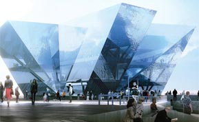 1. REX
Basically I like this one best because of the visual impact it has, it looks impressive from the outside but also exposed those inside to the impressive views over the Tay. I think it would make a great feature at the waterfront and is obviously very different than any other planned buildings for the location.
The glass face and angles remind me of ice or icebergs which perhaps hints at Dundee’s history with south atlantic exploration, whaling etc.
The only unknown aspect of this design for me is how the glass panels will be connected, it’s not that apparent from the visuals or the model as they just appear to be huge panels of glass.
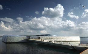 2. Snøhetta
This building is very different than the Kuma, completely understated in comparison to the Kuma and most of the other finalists. However, the Snøhetta design reveals itself more when you look into it, it is actually intended to rise and fall with the tide and will actually generate energy for use in the building.
I think it’s really important that whichever design is chosen it should really make the best use possible of renewable, sustainable energy sources such as solar, wind and tidal power. All three of which are available at the site of the building. Although this design has much less visual impact from the shoreline it actually looks great from the river itself.
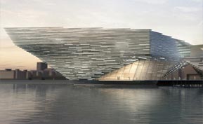 3. Kengo Kuma
This was originally my favourite design, it has a big impressive aspect which is reminiscent of a ships bow and stern from certain angles, presumable this isn’t just me making it up and it is intentional! The light appearing through the horizontal strips of the buildings exterior is subtle and would look amazing at night time.
The biggest problem I see with this design is how it will look as time goes on, it looks to be the perfect seagull magnet with all of the horizontal beams of the structure presenting perfecting roosting locations for seabirds. An unfortunate clash with reality there for this design, I can’t see how they could prevent this from happening without resorting to prevention methods which would be both costly and unsightly.
Perhaps another issue is cost, I’ve read some comments that suggest it would be overly ambitious to achieve for the overall budget, we don’t want to see another Scottish Parliament style overspend.
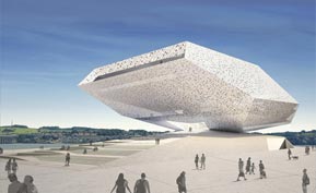 4. Delugan Meissl
My initial reaction to this design was that it looked pretty crazy, like a spaceship had just touched down in the middle of a plaza. However, having looked at the model closeup I actually quite like the interior space.
It’s quite an unusual, imposing design (to say the least!) which definitely makes a statement. However, it’s perhaps a bit too off the wall. It’s also not very clear how the exterior finish will be done, it looks to have some form of translucency to it, almost like a see-through space shuttle with the black and white colour. I’m not sure if it’s a little bit too retro-futuristic.
One other concern with this design is how it will work with the forces of the wind, it can get a bit windy down on the river sometimes – will there be some unexpected wing effect? It’s an interesting concept and the interior offers space which would definitely be very functional and would work well for gallery space etc, perhaps better than some of the other designs. Overall, perhaps it’s a bit too "Take me to your Leader" to be in the running.
 5. Steven Holl
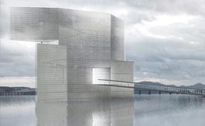
I’m now getting to my least favourite of the designs. I’m pretty unimpressed by this design overall, partly due to the renderings of it just being quite vague. It looks quite indistinct and hazey, like the Meissl design I can quite see how the surface of the building will look or function – is it glass or a cloth-like material?
The renderings showing this design against the backdrop of Dundee really didn’t work for me either, it just didn’t look good. Overall the renderings make it look like a building that’s only half there – like a building that is trying to appear from another dimension but can’t quite make it all the way.
It really just looks quite non-distinct, you can see from the rendering to the right that it just merges in with the grey-ish clouds they’ve depicted in it, all of the other renderings are the same. Perhaps if they’d presented it in nice bright sun light it would have a better impression upon me. Dundee is considered to be the sunniest city in Scotland so at least presenting it in that light would help.
 6. Sutherland Hussey
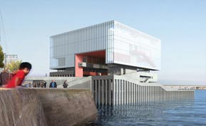
Last in my ranking is unfortunately the design by the only Scottish architect practice. My initial impression is that it is just too boxey, especially in comparison to the other finalists.
It just doesn’t seem organic in anyway, I don’t mind the main aspect of the building to some extent but it’s the surrounding vertical columns of the pier it’s set on that further add to the rigid box-like appearance. Perhaps if it was on a softer, smooth landscaped environment then the simple box shape of the building would make an interesting juxtaposition?
So unfortunately it’s last in my ranking, although I’d say it’s probably tied with number 5 though, the more I look at number 5 I would perhaps be tempted to swap them over, but I’ll leave it as they are for now.
~ ~ ~ ~
What I’m really interested to hear about for all the designs is the type of materials, the use of renewables etc. The location provides great opportunity to make use of things like vertical axis wind turbines and tidal power generation, Dundee hopes to be at the forefront of renewable energy technology so these buildings should walk the talk too.
You can view more about all 6 finalists over at http://vandaatdundee.com/your-future/shortlist/.