A work-around for aspect-ratio percentage padding issues on flex items in older versions of Firefox and Edge

Whilst working on a recent project I needed to enforce a fixed ratio on some elements in the layout. In this case I used the ‘Aspect Ratio’ method which uses a ‘0’ height element with a percentage-based ‘padding-top’ value (More info about that in this CSS Tricks article).

The problem I ran into was that I was also using Flexbox for layout so each element was a Flex item, all of this was fine in Chrome and Safari and also in recent versions of Firefox and Microsoft Edge 17, 18 and in the upcoming 19.

But when testing in Edge 15 and 16 I found that the elements with the aspect ratio method applied to them were just completely invisible. Looking into it further I came across a Stackoverflow post and discovered that the issue was that in these versions of Edge they were supporting an earlier version of the Flexbox specification which meant that the percentage-based padding-top had no effect, basically rendering these elements with a ‘0’ height so they didn’t show up. It seems that the Flexbox specification was updated circa 2018 and basically brought it in line with the way Chrome and Safari have always behaved.

An alternative way of specifying the padding-top value is to use the ‘vw’ viewport-width units instead of percentages, whilst I found this did work to some extent it was harder to keep the ratios exactly how I wanted, but at least it was a way that would get these elements working in older version of Edge. Rather than having to completely redo my markup and CSS just to support these older browsers I wanted to see if there was a way to target only these earlier versions of Edge and use ‘vw’ units for Edge 15 & 16 but keep percentages for all other browsers.

As it happens I was also using “Variable Fonts” on this site which are only supported in Edge 17+, as such as I was already testing for Variable Font support by using ‘@supports (font-variation-settings: normal)’, so combining this with another parameter ‘(-ms-ime-align: auto)’ which allowed me to target Edge I came up with a workaround.

Here’s an example of how it would be used, in this case it is a 3-up layout so each element is 1/3rd of the page width so set at 33.33333% of the width and then a padding-top set to the same percentage. The first CSS block sets the main styles and the second block adds the ‘@supports’ check which overrides the first for matching Edge versions:

.aspect-block {
    padding: 0;
    position: relative;
    flex: 0 0 33.33333%;
    height: 0;
    overflow: hidden;
   padding-top: 33.33333%;
}
@supports (-ms-ime-align: auto) and (not (font-variation-settings: normal) ) {
    .aspect-block  {
        padding-top: 33.33333vw;
    }
}
Adobe BrowserLab – Hosted Browser testing from Adobe

BrowserLab logoAdobe have added a lot of new projects to their Labs page over at http://labs.adobe.com since I’d last checked it out. In particular there’s a new service / product called BrowserLab that allows you to test web pages in various browsers along the lines of Litmus, Browsershots or Netrenderer. Adobe describe BrowserLab as:

BrowserLab provides web designers exact renderings of their web pages in multiple browsers and operating systems, on demand. BrowserLab is a powerful solution for cross-browser compatibility testing, featuring multiple viewing and comparison tools, as well as customizable preferences. Since BrowserLab is an online service, it can be accessed from virtually any computer connected to the web. Also, Adobe Dreamweaver® CS4 software users have access to additional functionality such as testing local and active content.

This service / app has been in development for some time, Adobe actually showed a sneak peak of it back in November at their Max Conference under the code name ‘Meer Meer‘. So although this might seem like Adobe playing catchup with Microsoft’s recent ‘SuperPreview‘ release it’s actually nothing of the sort. If you compare BrowserLab with SuperPreview you’ll see that they’re quite different apps – primarily that SuperPreview is a Windows app that only let’s you preview IE6 and either IE7 or 8 depending on which is installed – and of course requires you to be running on Windows to use it whereas BrowserLab is a browser based application that simply requires the Flash plugin and therefore works on both Windows, Mac and Linux.

Browser and OS versions currently supported in BrowserLab at this time are:

  • Firefox 2.X and 3.X (Windows XP and Mac OS X)
  • Internet Explorer 6.X and 7.X (Windows XP)
  • Safari 3.X (Mac OS X)

So a good range of browsers are covered, although IE8 really needs to be there along with Opera as well to really cover all the main desktop browsers. Although there isn’t yet as big a range of browsers to test in compared to other services like Litmus, BrowserLab has a benefit in that it provides some additional tools to help you compare the preview of your site in the different browsers.

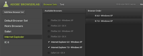
Browser Sets in BrowserLab – Only preview preferred browsers.

Browser Sets in BrowserLab basically let you create groups of browsers that you want to have rendered when testing. This can save time over just having every browser preview rendered for your site, if you only want to see IE6 and IE7 then you can create a BrowserSet with only those contained in it.

Image of Browser Sets options

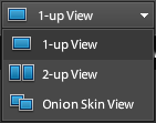
BrowserLab views menu option2-up View in BrowserLab

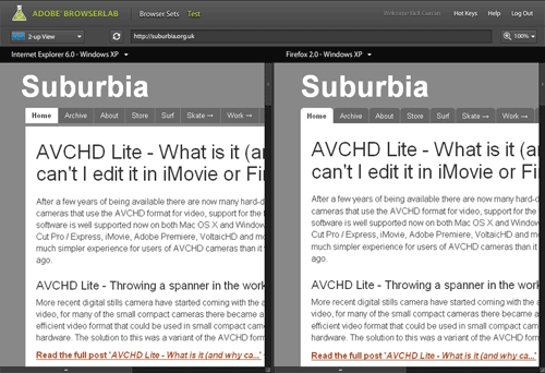
You can view a 2-up layout that lets you compare the differences between rendered previews. This creates a side-by-side view displaying two different browsers which you can quickly switch between to compare different browsers.

You can also zoom up to 200% to compare the previews more closely and also zoom out to 75% to get a more overall comparison.

Image of 2-up View in BrowserLab

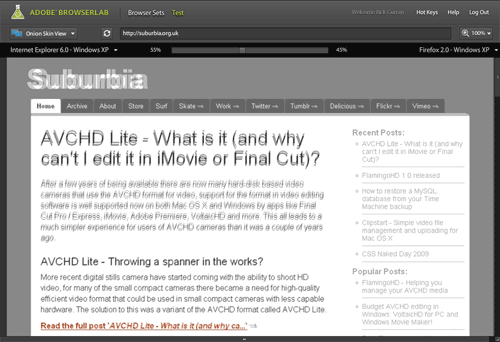
Onion Skin view in BrowserLab

The Onion Skin view lets you compare two different previews but overlays them on top of one another. You can then use a slider to fade between the two selected browser previews, if you’re trying to work on something quite pixel accurate then this can be quite useful – although it has to be said that exact pixel placement accuracy of page layouts isn’t necessarily something to worry about. It’s still a pretty useful feature though.

Image of Onion Skin view in BrowserLab

Preview directly from Dreamweaver CS4 in BrowserLab

One other feature benefit that BrowserLab has over other services such as Litmus is that there is a Dreamweaver CS4 extension that allows you to test your site layouts directly from within Dreamweaver. The added benefit here is that this avoids the step of having to make your entire page live on the web before testing as it works with just the local files on your system.

As a beta release BrowserLab looks pretty good, although it does have some hot competition from services like Litmus and Browsershots – especially in regards to Litmus’ push towards supporting mobile Safari on iPhone / iPod touch.

To checkout BrowserLab for yourself, read more about it over at the BrowserLab pages at Adobe Labs website.