I’m working on an interesting project using a Raspberry Pi Zero W computer with the Pi Camera module. Basically the idea is to take scheduled periodic photos via the Pi Zero and camera and then upload them to a WordPress site and then set the latest photo as the Header Image.
There was one thing that took me a little while to figure out and that was how to set the desired image as the header image in WordPress, I struggled to find anything whilst Googling so I thought I’d quickly write up a post about it.
Continue reading “Dynamically setting an image as the header image on a WordPress theme“
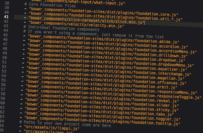 I have been working more and more with build tools in my web development process over the last year and I’ve found a Gulp based workflow with the recently launched Foundation 6 works great and I’ve been gradually getting my head around the whole process.