Apple recently announced updates to the core software on all of their hardware platforms with various interesting new features.
One feature that jumped out when looking through it all was support for displaying web content in watchOS 5, it’s important to clarify that they haven’t added a standalone Safari app to watchOS but instead it enables any links sent via Mail or Messages to be accessed and then displayed right on the watch.
To get a quick overview it is worth taking a few minutes to watch the “Designing Web Content for watchOS” video on the WWDC2018 videos site as it gives a good overview.
Here’s a few thoughts and info about key aspects that I picked up from watching the video:
User navigation / interaction
- You can scroll using the Apple Watch’s digital crown or via pan gestures
- Double-tap to zoom in / out on the page content
- Back/Forward navigation is controlled either via an overlay UI brought up via a firm press on the screen or by swiping back and forward from the edges of the screen.
Web browser feature support
Content is optimised for display on the Apple Watch so certain features are not supported in watchOS 5:
- Video playback
- Service workers
- Web fonts
If the web content being accessed is responsive then it treats the content as being 320px wide, the same width as if on an iPhone SE (iPhone 5 or older width). So text may be smaller but at least it will basically render the smallest breakpoint content, so it doesn’t require any new even smaller breakpoint to be catered for.
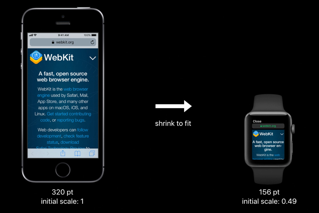
This is done by overriding the “initial-scale” value and provides a viewport with the dimensions 320px by 357px and reports a media query size of 320px. So existing responsive content will render on the Apple Watch without requiring any changes – at least from a layout perspective, worth noting the lack of support for Web fonts as this will likely have some rendering impact as it falls back to alternative fonts in the font stack do display.
Optimising content for Apple Watch
Even though responsive content will be rendered quite well by default it is possible to optimise content for display on Apple Watch.
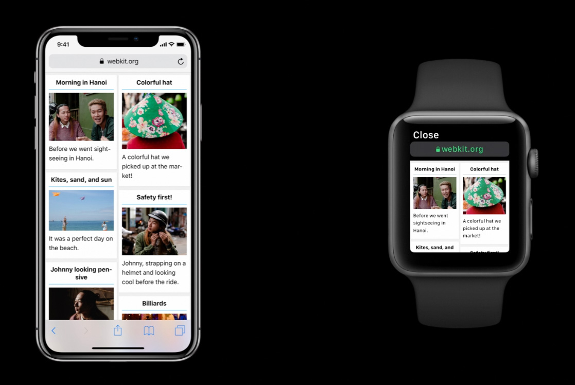
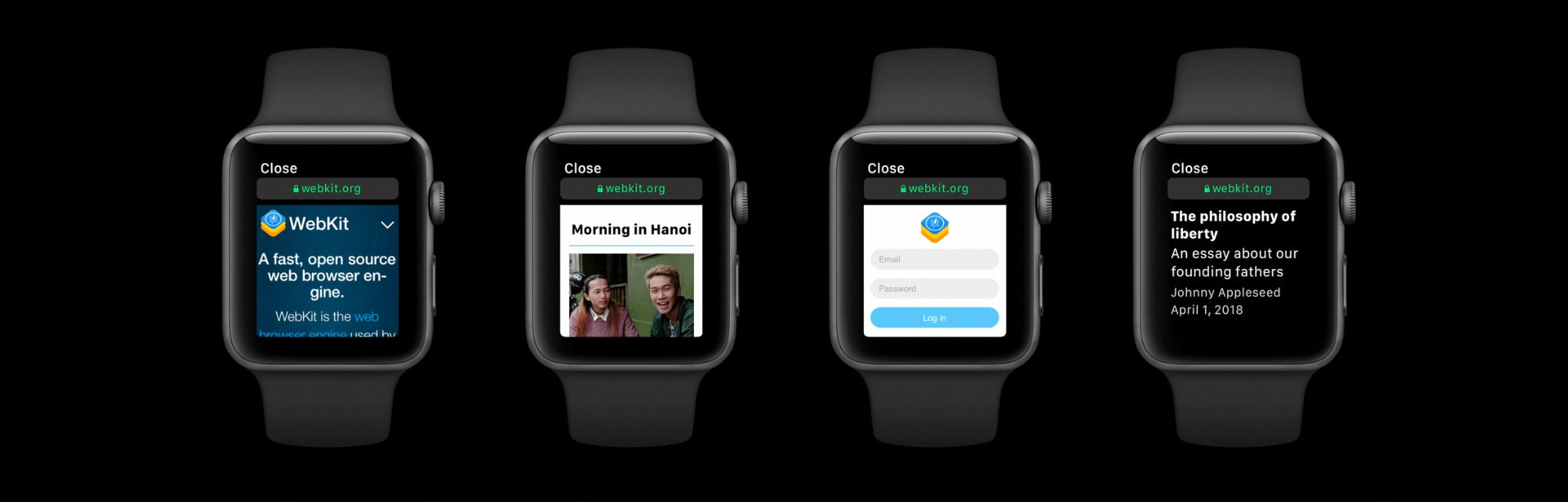
The above image shows the standard responsive content being displayed on the Apple Watch, basically just the same as it would be on an iPhone SE (minus any web fonts of course!).
Responsive Layout on Apple Watch
Using a media query it is possible to modify this layout to display as a single column. There is an example given in the video which obviously won’t apply for all uses, but basically it uses “min-width: 320px” as the baseline for showing the content as two columns, so any content below that would render as a single column. Again, how this works specifically for your layouts will vary, but there will be some methods to use for frameworks like Foundation or Bootstrap etc.
“Disabled-adaptations” meta tag
The important addition to using a media query though is a new meta tag which disables the default adaptations that the Apple Watch makes when rendering content by default:
<meta name=”disabled-adaptations” content=”watch”>
With this meta tag in place the device width will be treated as the real width of Apple Watch’s screen. This again has similarities to how content was handled when the iPhone originally came out, existing content is displayed as best as possible but there are ways to optimise for the device if you want to.
Form controls on watchOS
Making use of HTML5 form control types is really important on watchOS, setting the type attribute to “email”, “tel” etc will bring up a specific, full screen UI to allow interaction.
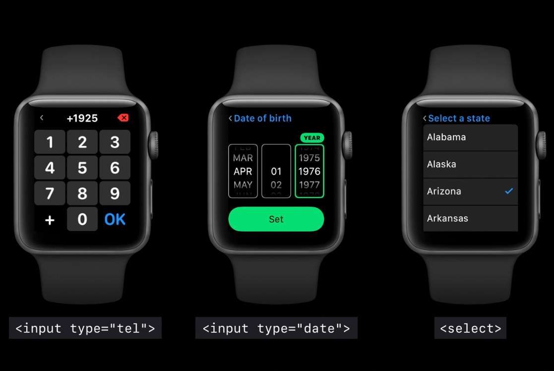
Additionally making use of labels, placeholder or aria-label attributes enhance the context given when interacting with these controls. Hopefully you’re using these already but here’s another reason to do so.
Safari Reader on watchOS
This is a feature found on iOS and macOS which basically formats pages to show a more readable version of web page content. It’s a little unclear from the video but it sounds like pages that are “text heavy” will get displayed using Reader, although I’m not 100% sure how that would be determined exactly if so. Perhaps this is a way to handle big pages that might have a lot of adverts on it? Reader view is an option that users can choose by firmly pressing on any page to bring up the navigation overlay, so even if content is displayed normally a more readable version can be accessed.
Semantic markup in Reader view on watchOS
Reader view makes good use of semantic markup, using the “article” tag helps the display of content, and attributes like “item-prop” and other semantic tags like “strong”, “em”, “blockquote” etc enhances the display of content in Reader on watchOS.
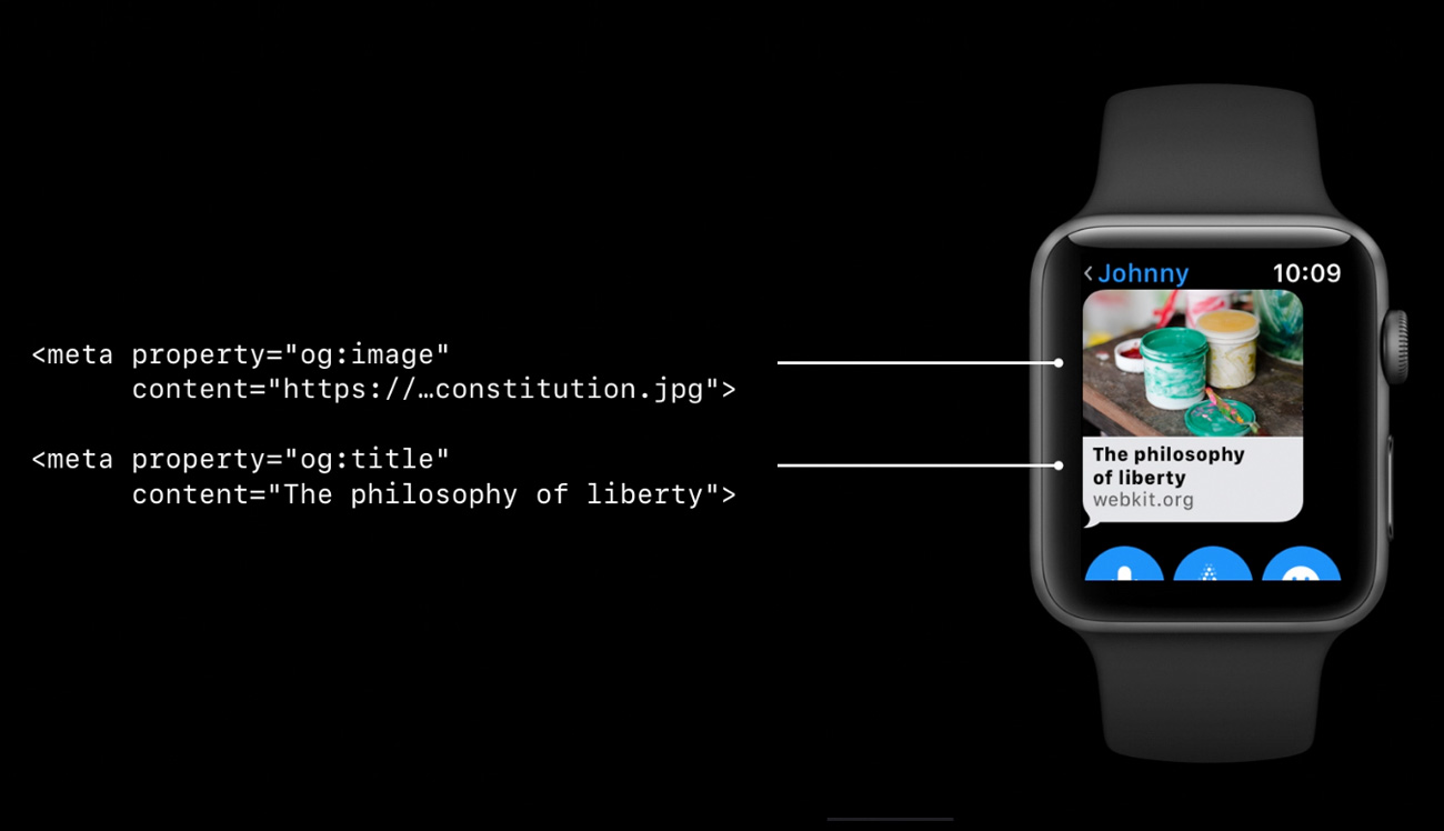
Open Graph meta tags
Using Open Graph meta tags is something that makes sharing content around the web such as into Facebook, Twitter etc look better by providing specific preview content such as images, titles etc. watchOS makes use of these Open Graph meta tags to make the previews for any shared links look as good as possible.
That’s a quick overview of some aspects of watchOS 5’s support for web content, there’s definitely a few things to consider in there but if you’re building pages using responsive layouts and using semantic HTML then things should work fairly well without having to do anything.
The biggest issue I see initially is the lack of support for web fonts, that seems like it could cause some display issues due to the fallback to alternative fonts in the stack or if web fonts have been used for icons etc.
I’m also interested to know what the impact on battery life on the watch is like when loading and rendering multi-megabyte web pages which are not uncommon these days, I think Reader view is going to be an essential feature for viewing web content on Apple Watch.